
Surface Pattern & Product Design
Go Getter Girl Planner Collection
Designing two full planner collections for Go Getter Girl was one of those projects that stretches you creatively and reminds you why you love what you do.
This was more than a stationery design project. It was a full-scale product design experience — from concept development and hand illustration to print production and launch photography.
Working closely with founder Rachel, we brought her vision to life: planners rooted in encouragement, self-worth, and boldly pursuing your dreams.
The Vision: Encouragement in Physical Form
Rachel’s heart behind Go Getter Girl has always been clear — she wanted women to feel capable, confident, and deeply encouraged every time they opened their planner. Not just productive, not just organized, but empowered.
My role was to translate that mission into tangible, beautiful design — something you could hold in your hands and feel inspired by daily.
Designing Two Distinct Planner Collections
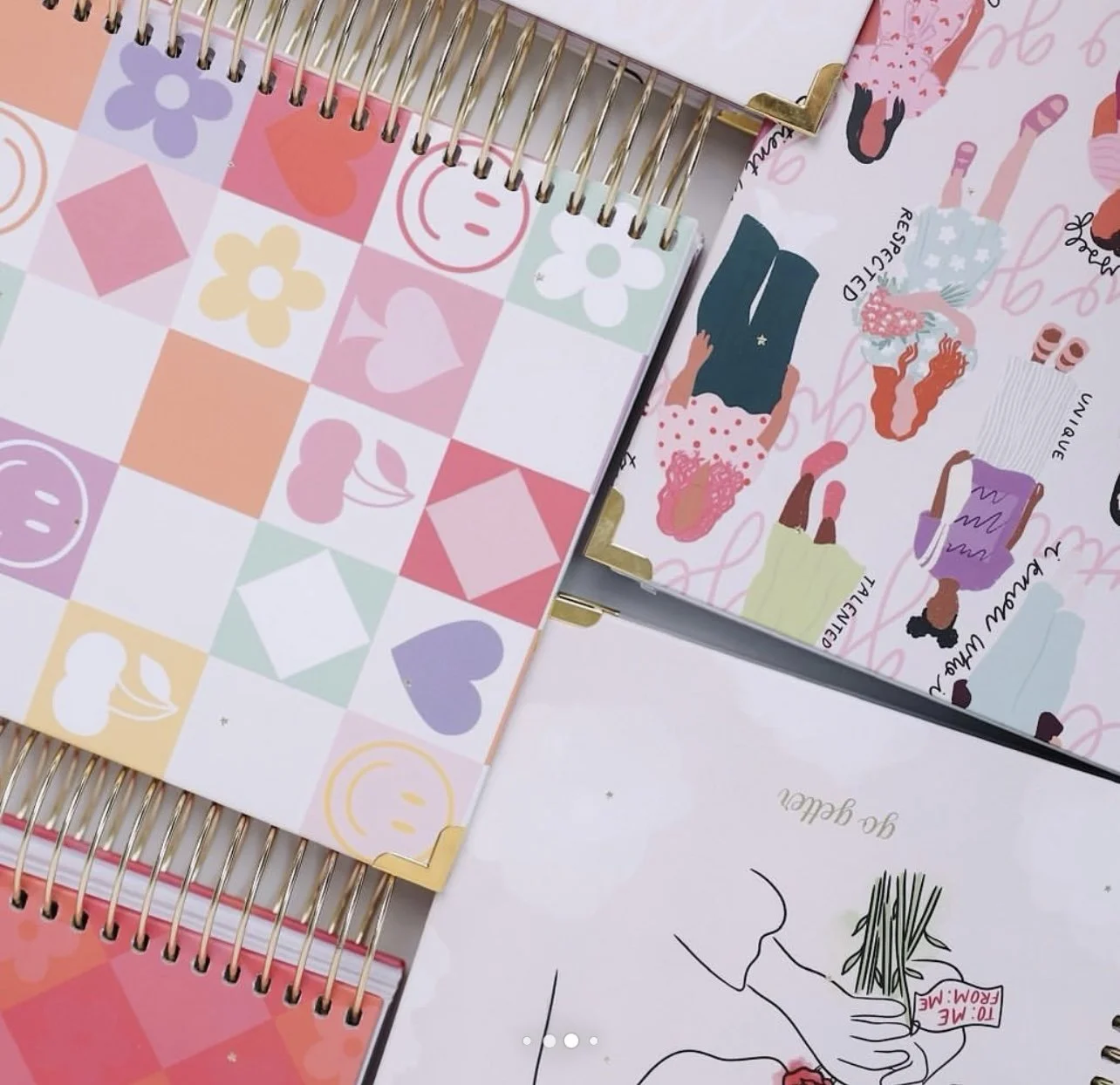
One of the most exciting parts of this project was designing two completely different aesthetic directions under the same brand umbrella.
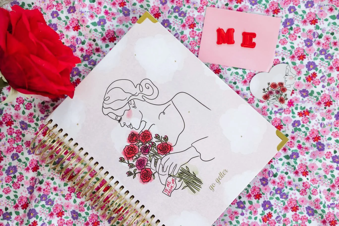
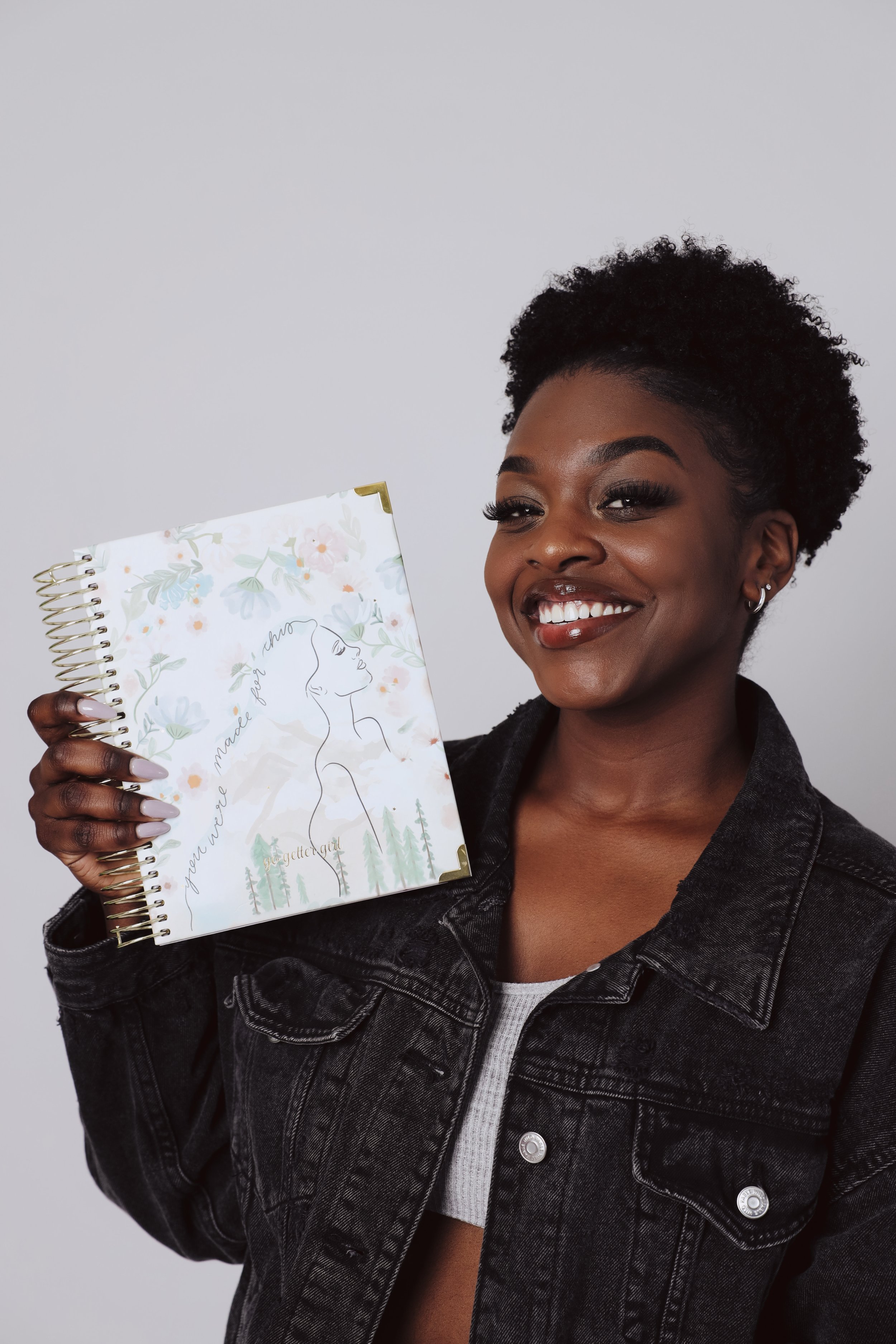
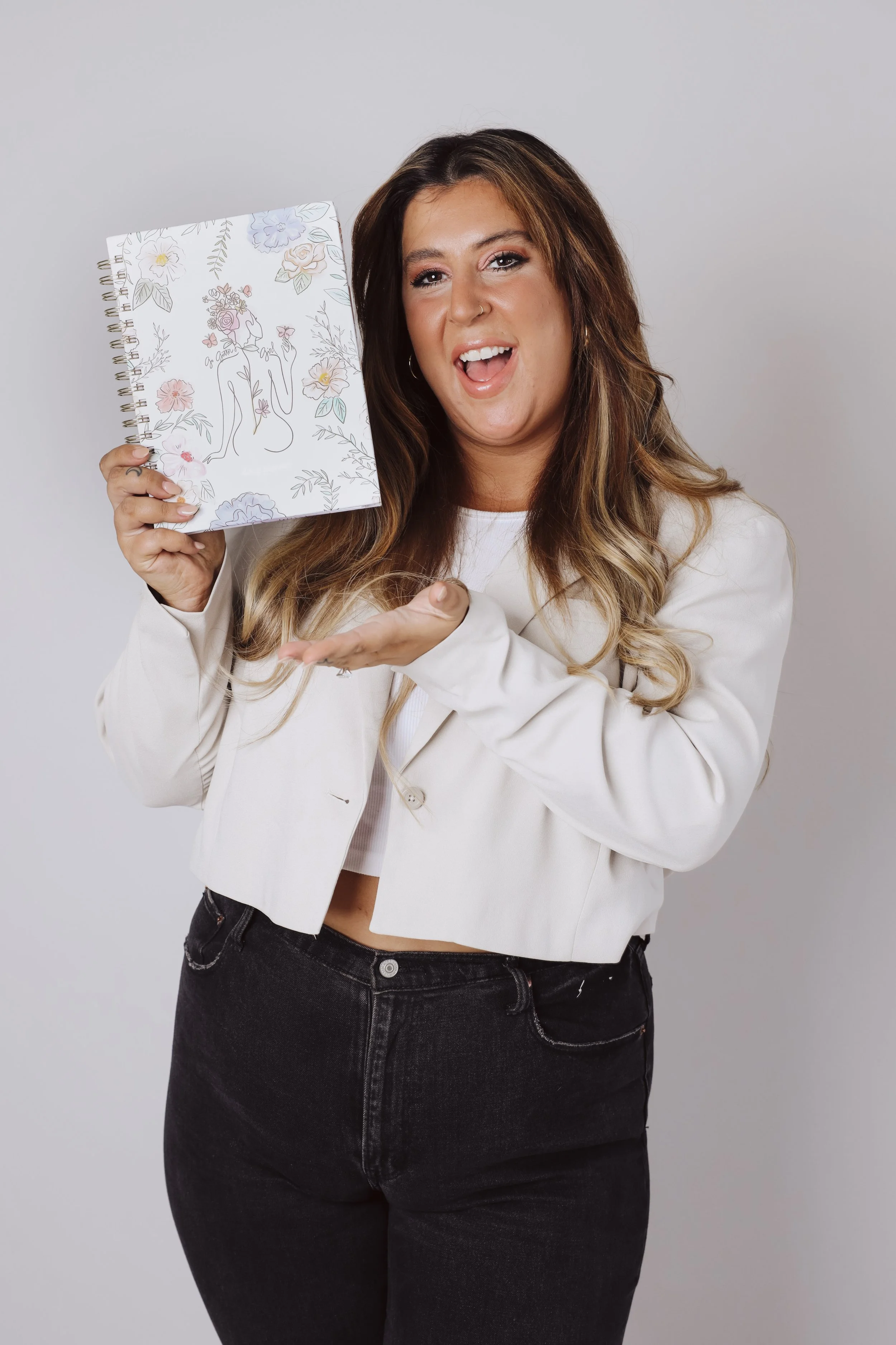
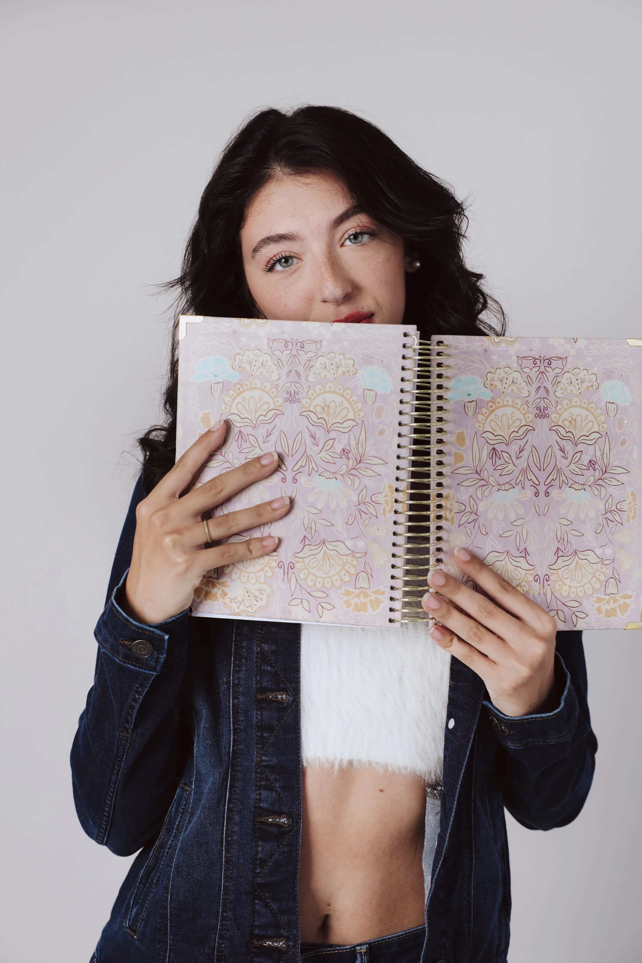
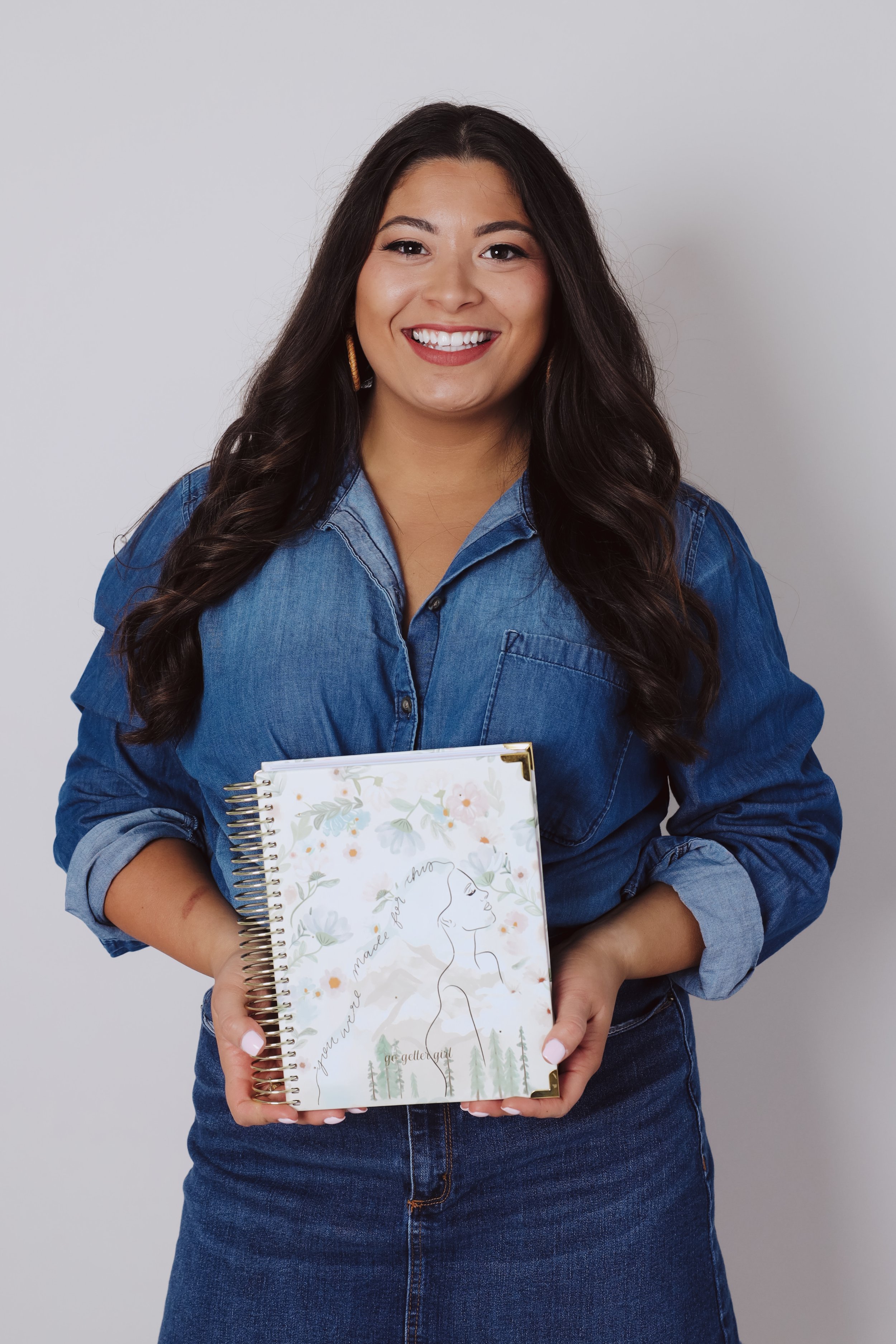
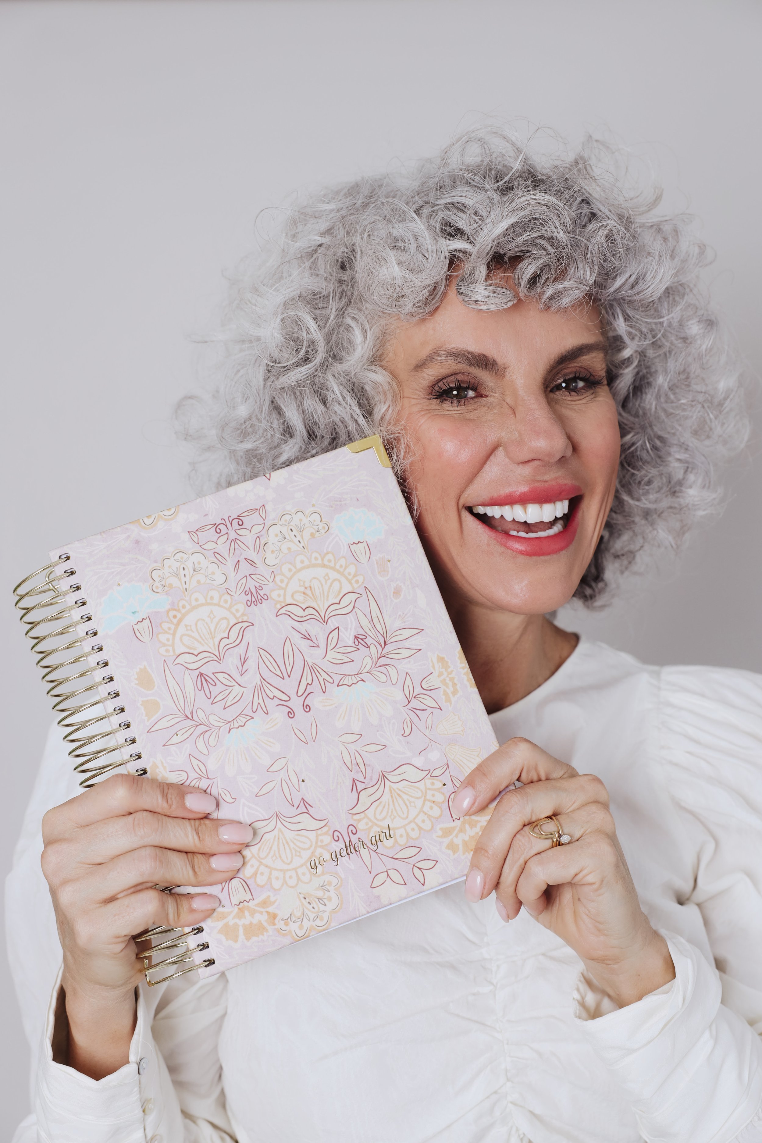
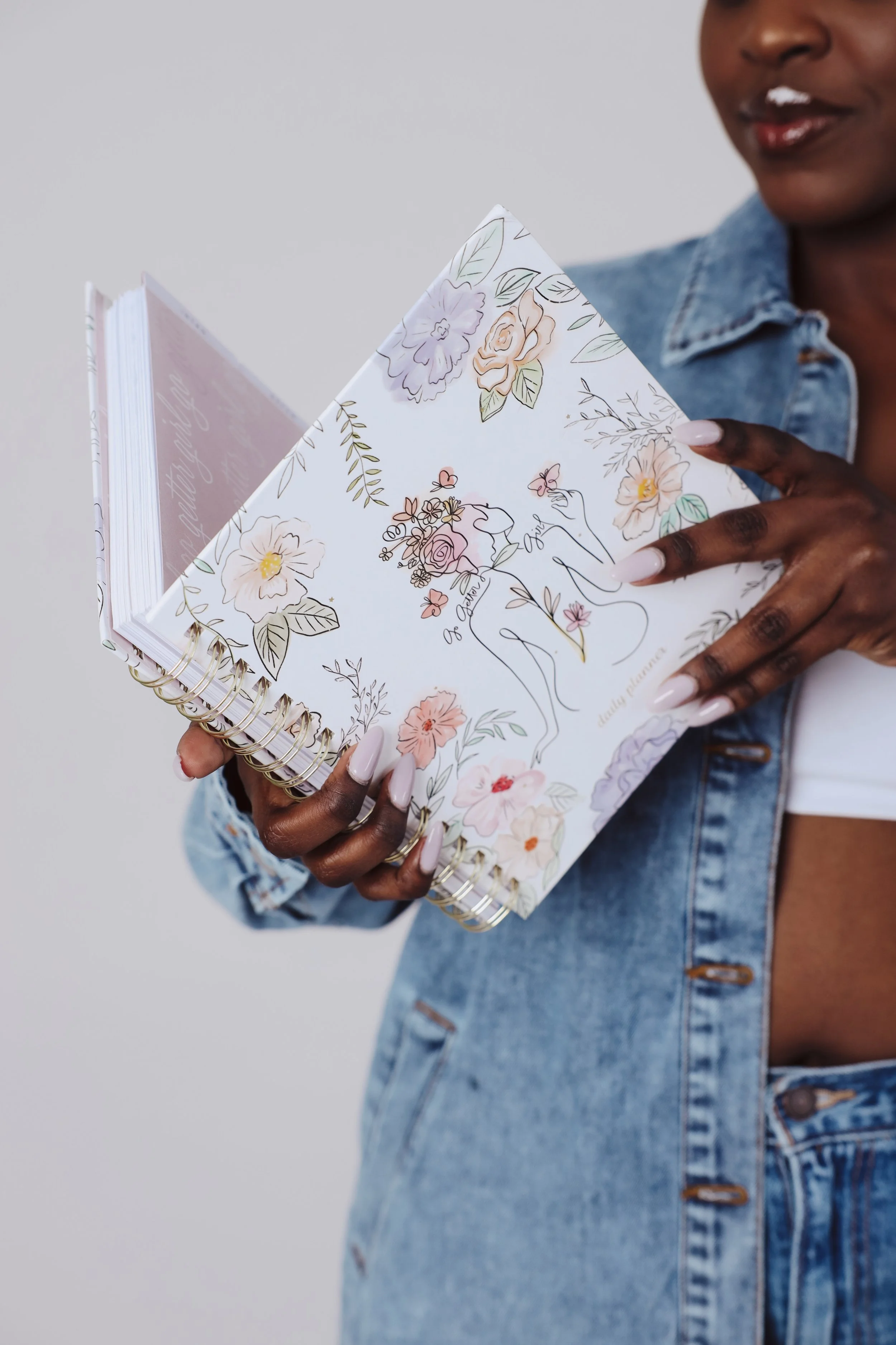
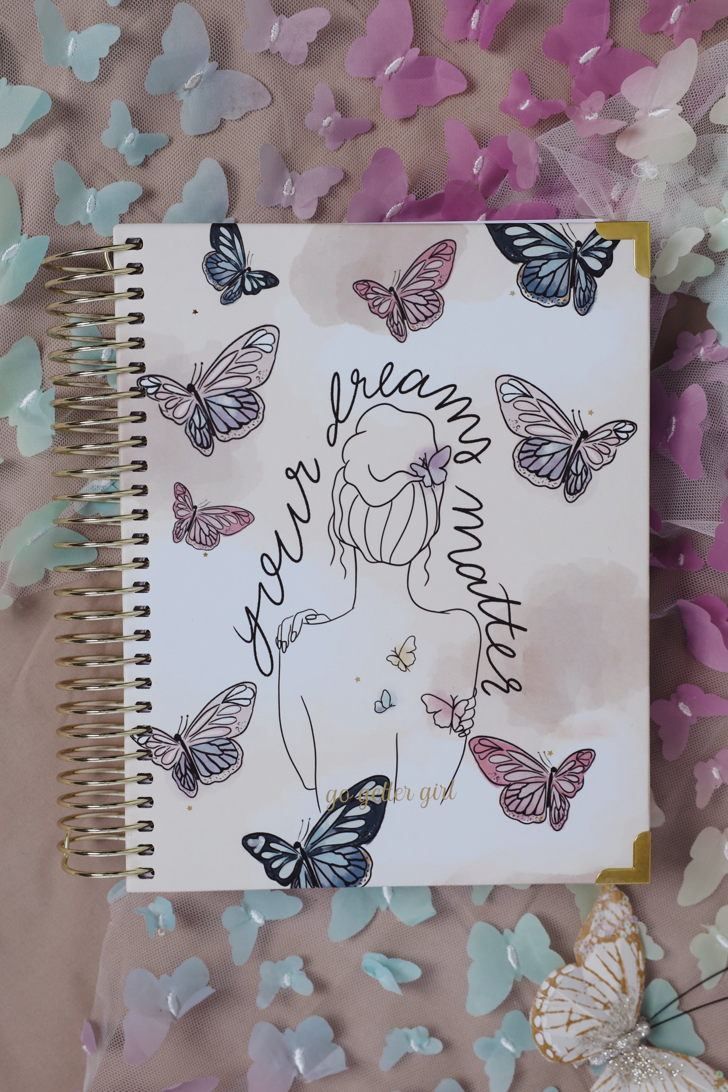
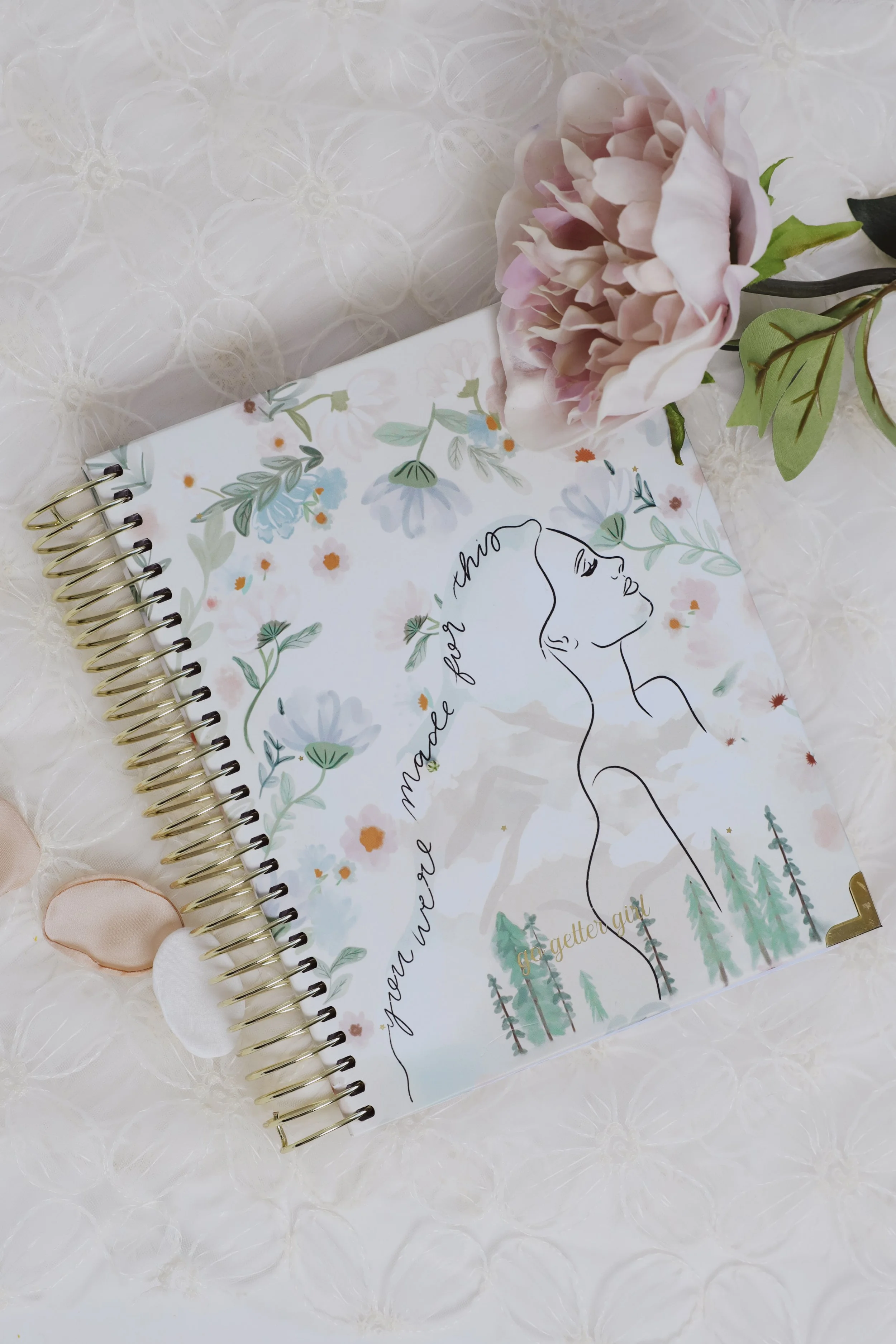
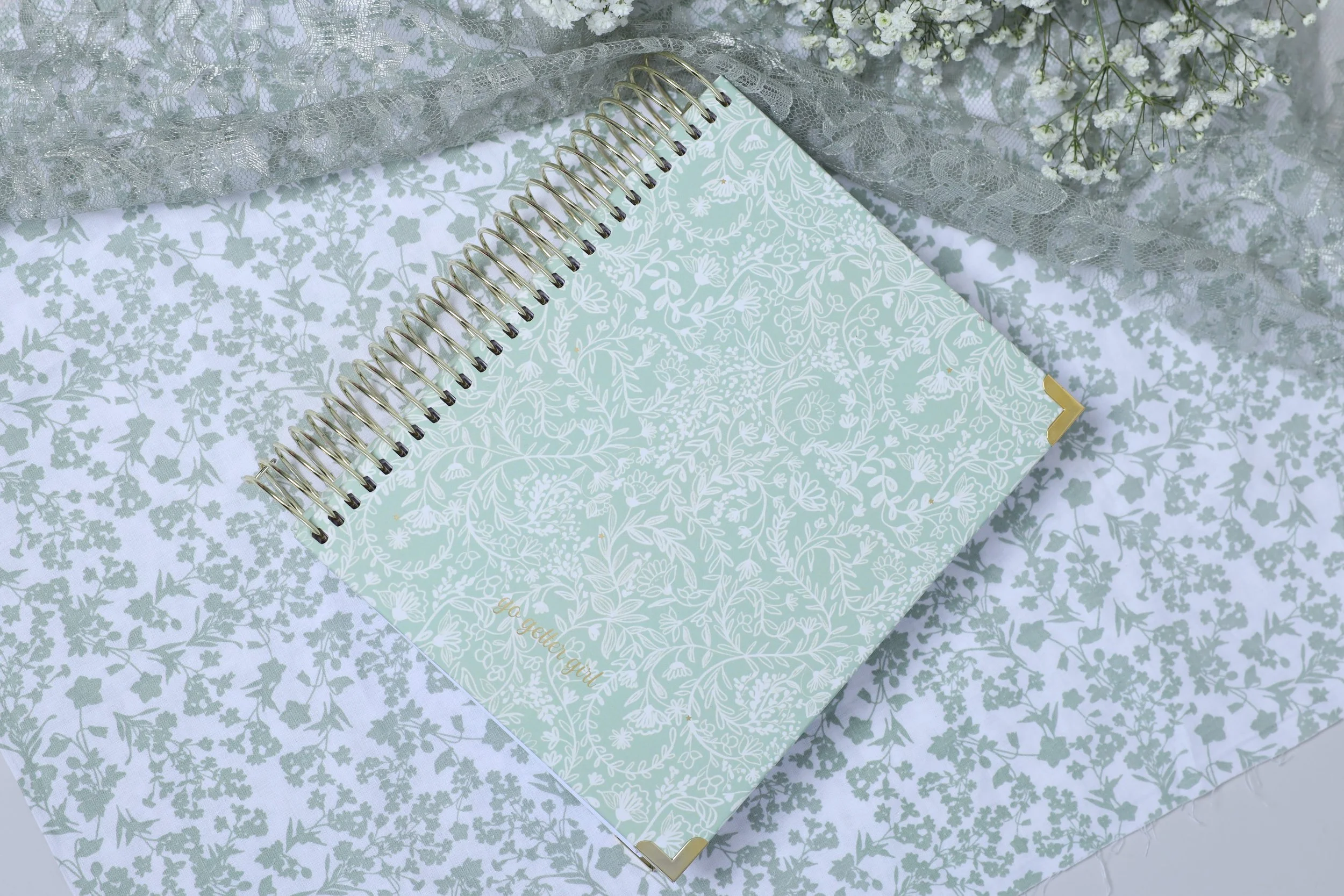
Collection One: Muted, Feminine, Parisian & Moody
This collection leaned romantic and refined.
Think:
Soft blush tones
Muted neutrals
Vintage-inspired florals
Delicate line illustrations
Subtle gold accents
The vibe felt elevated, feminine, and quietly powerful — like journaling in a Parisian flat with fresh flowers on the table.
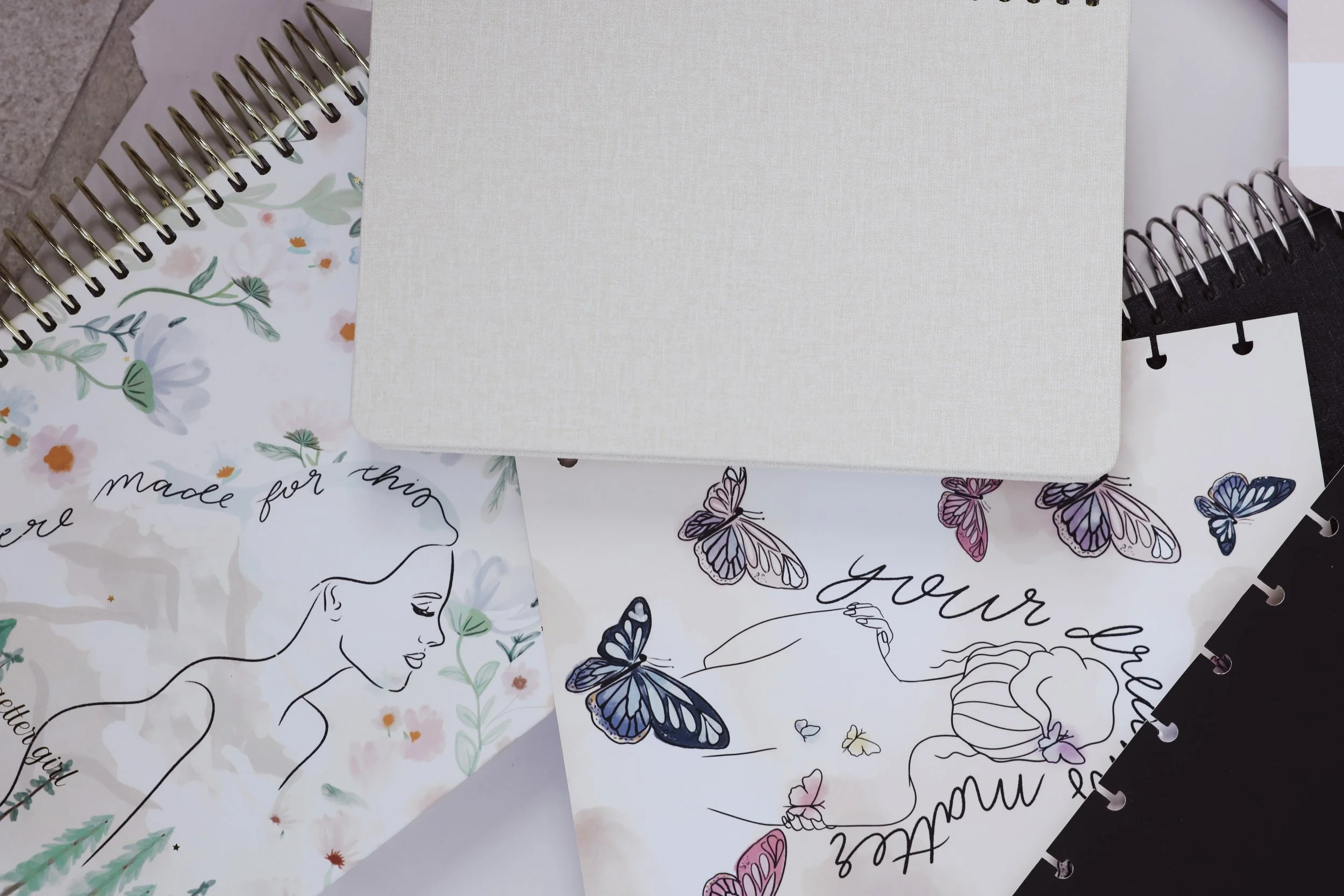
These designs featured hand-illustrated florals, butterflies, and minimal line art compositions, layered thoughtfully to create depth without overwhelming the cover.

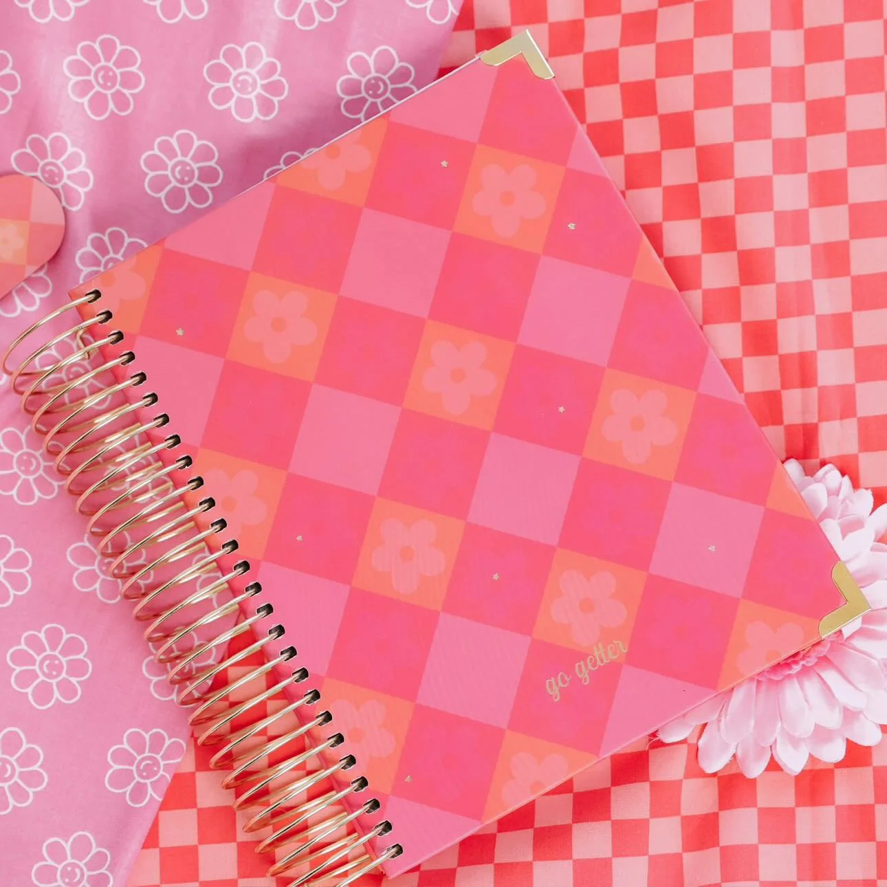
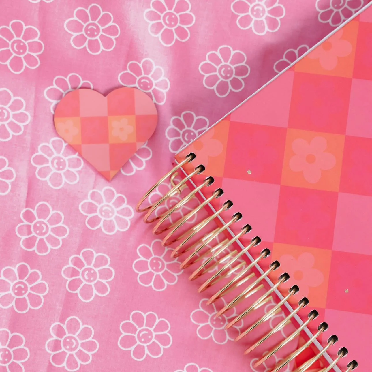
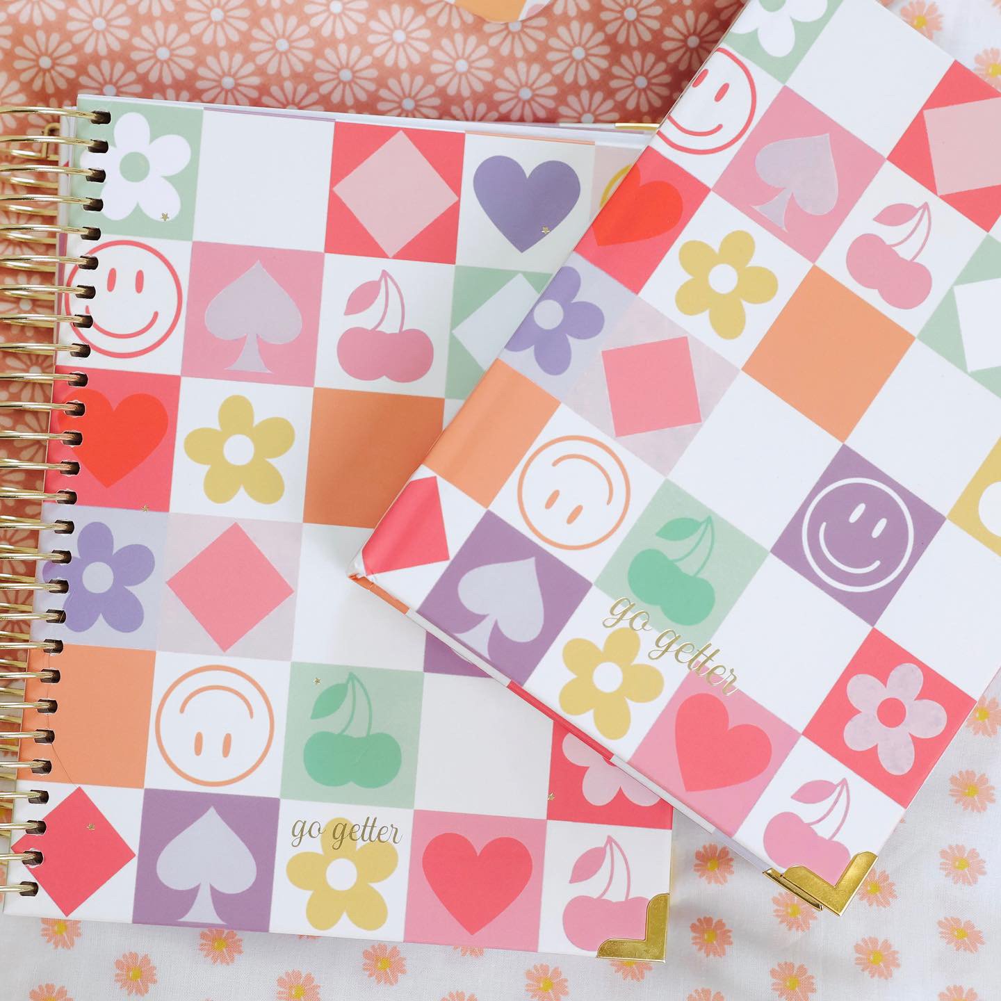
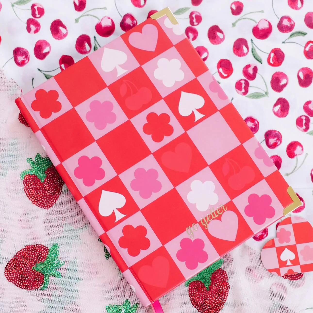
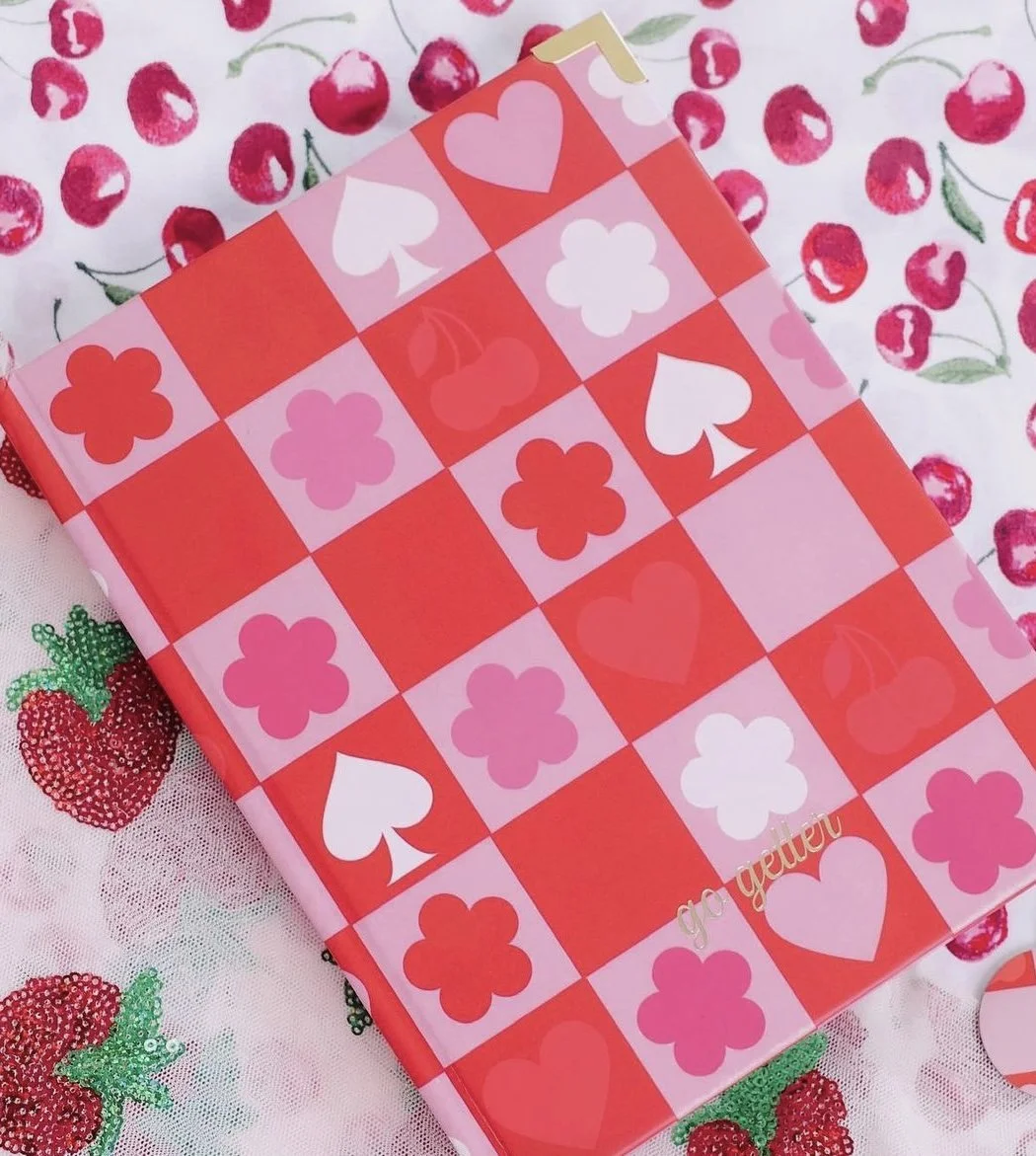
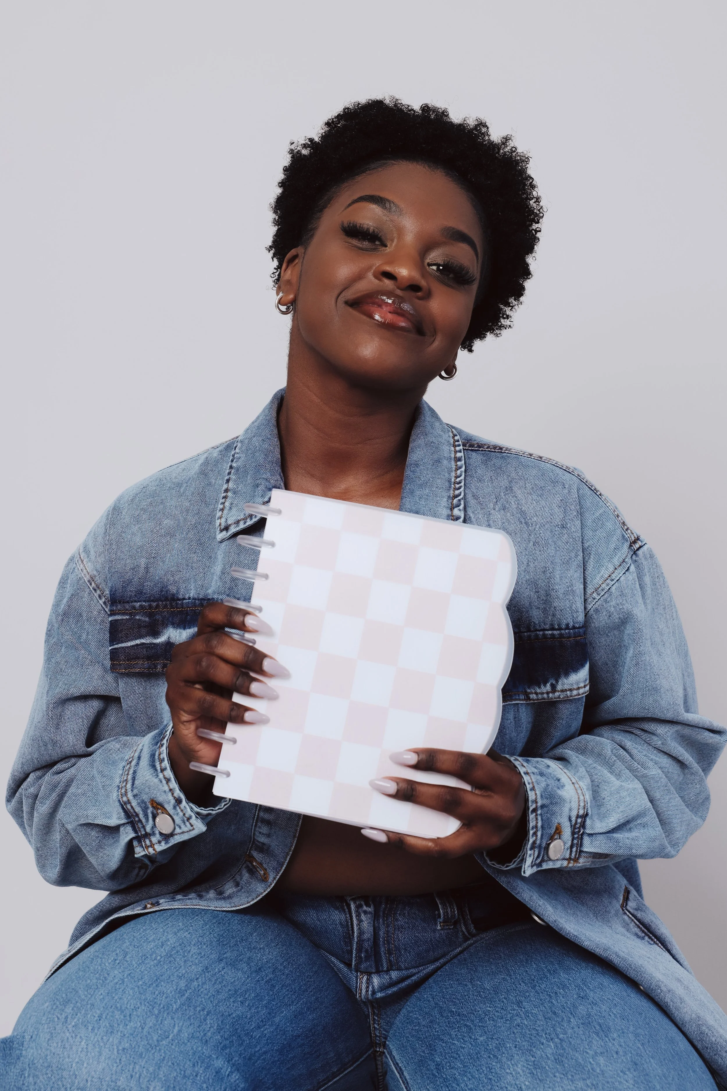
Collection Two: Bright, Funky & Vibrant
The second collection could not have been more different — and that contrast is what made this project so fun.
This line was bold. Playful. Confident.
Think:
Checkerboard patterns
Hearts, cherries, smiley faces
Punchy pinks, corals, purples, and greens
Retro-inspired iconography
The goal was energy. Movement. Motivation.
These planners were designed for the girl who wants her desk to feel colorful and inspiring — who thrives on visual vibrancy and bold encouragement.
Designing two contrasting collections strengthened the overall brand and expanded its audience reach.
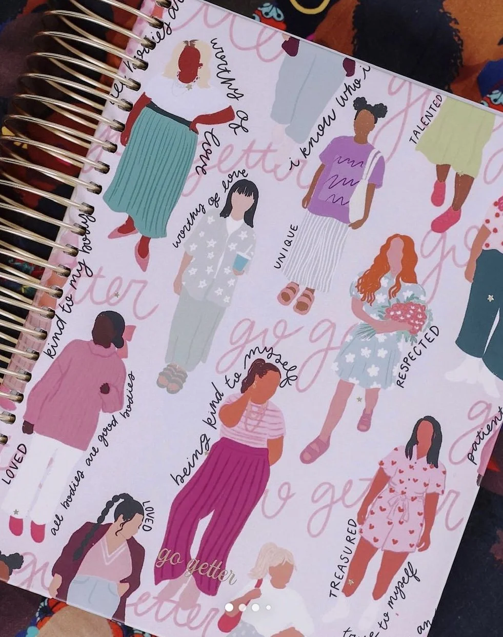
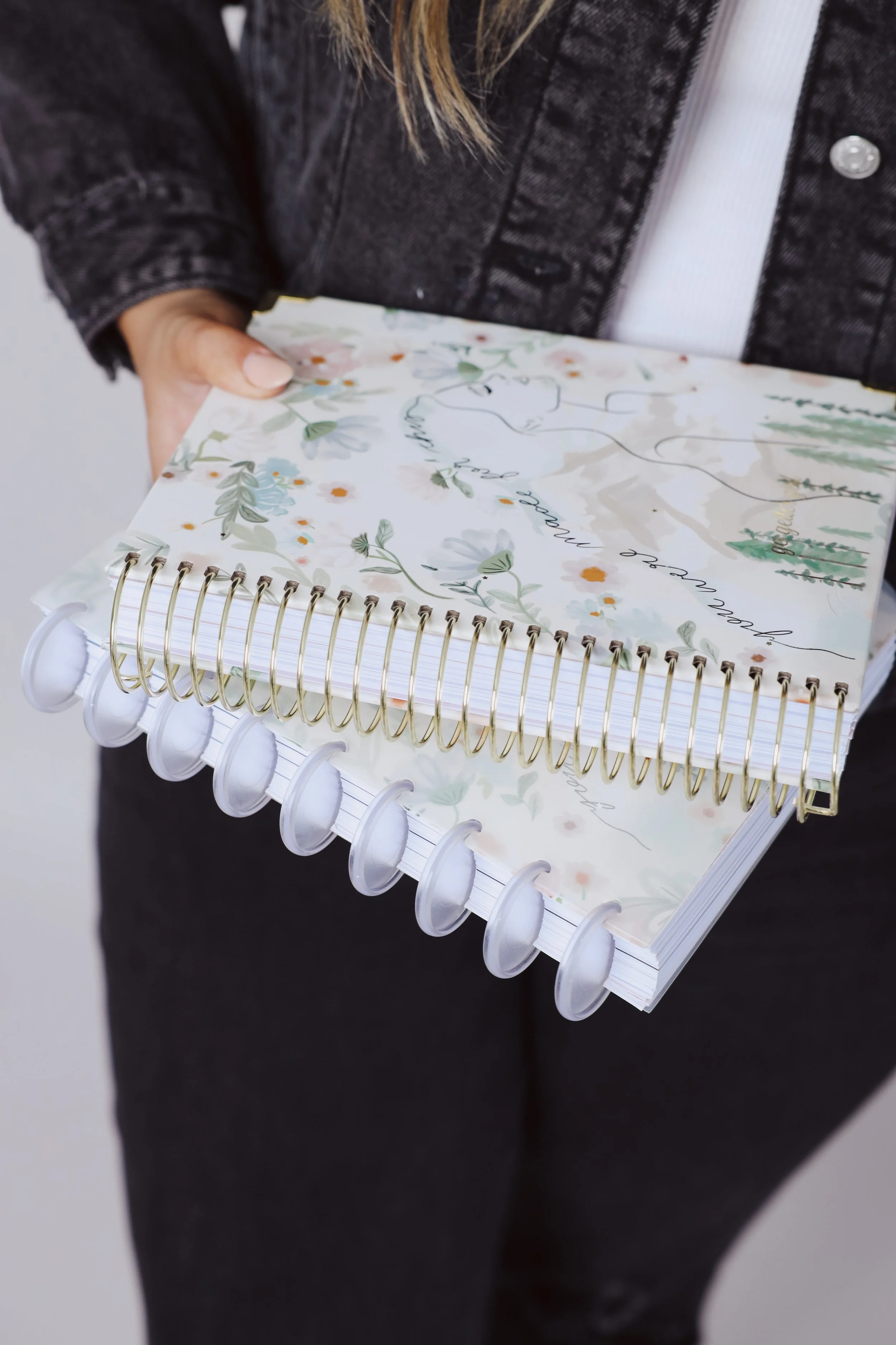
Hand-Illustrated Surface Pattern Design
Every single illustration was created by hand on my iPad using an Apple Pencil.
From the florals and butterflies to the retro icons and checkerboard motifs, this project was a full exploration of surface pattern design for print production.
Because these were physical products — not digital graphics — every detail mattered:
Pattern repeat precision
Scale adjustments for print
Spine alignment
Bleed and trim margins
Color calibration for manufacturing
Surface design for planners requires technical accuracy alongside creativity. It’s about ensuring what looks beautiful on screen translates beautifully to a printed, bound product.
Product Design & Manufacturing Collaboration
This was a large-scale print project that required close collaboration with a manufacturer.
We carefully reviewed:
Paper stock selections
Gold corner detailing
Spiral binding finishes
Cover lamination
Color proofing
Sample revisions
Multiple planner samples were printed and reviewed before final approval. Seeing the first physical prototypes in hand was such a full-circle moment. There is something uniquely rewarding about designing for production — knowing your work will live on desks, in purses, and in daily routines across the country.
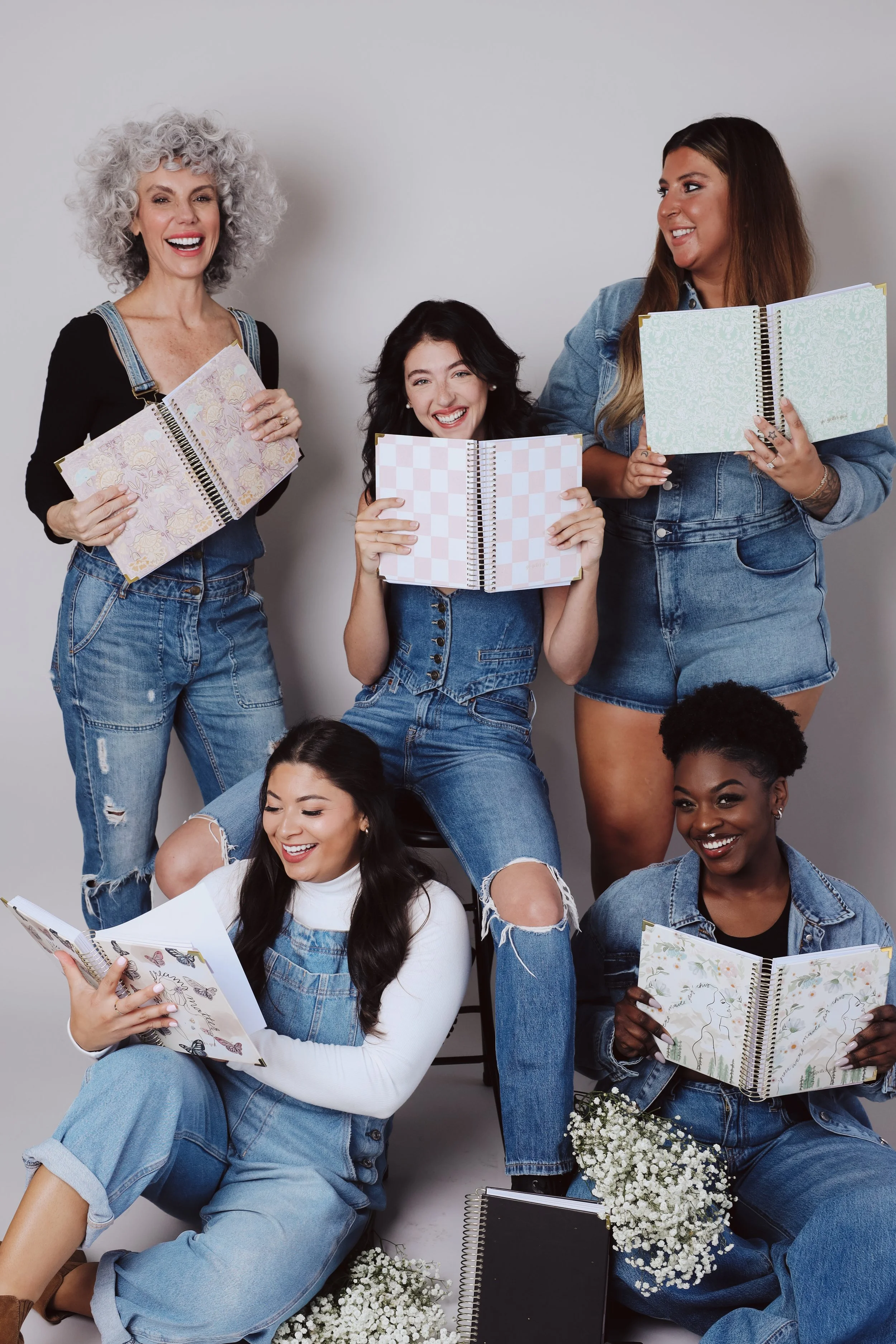
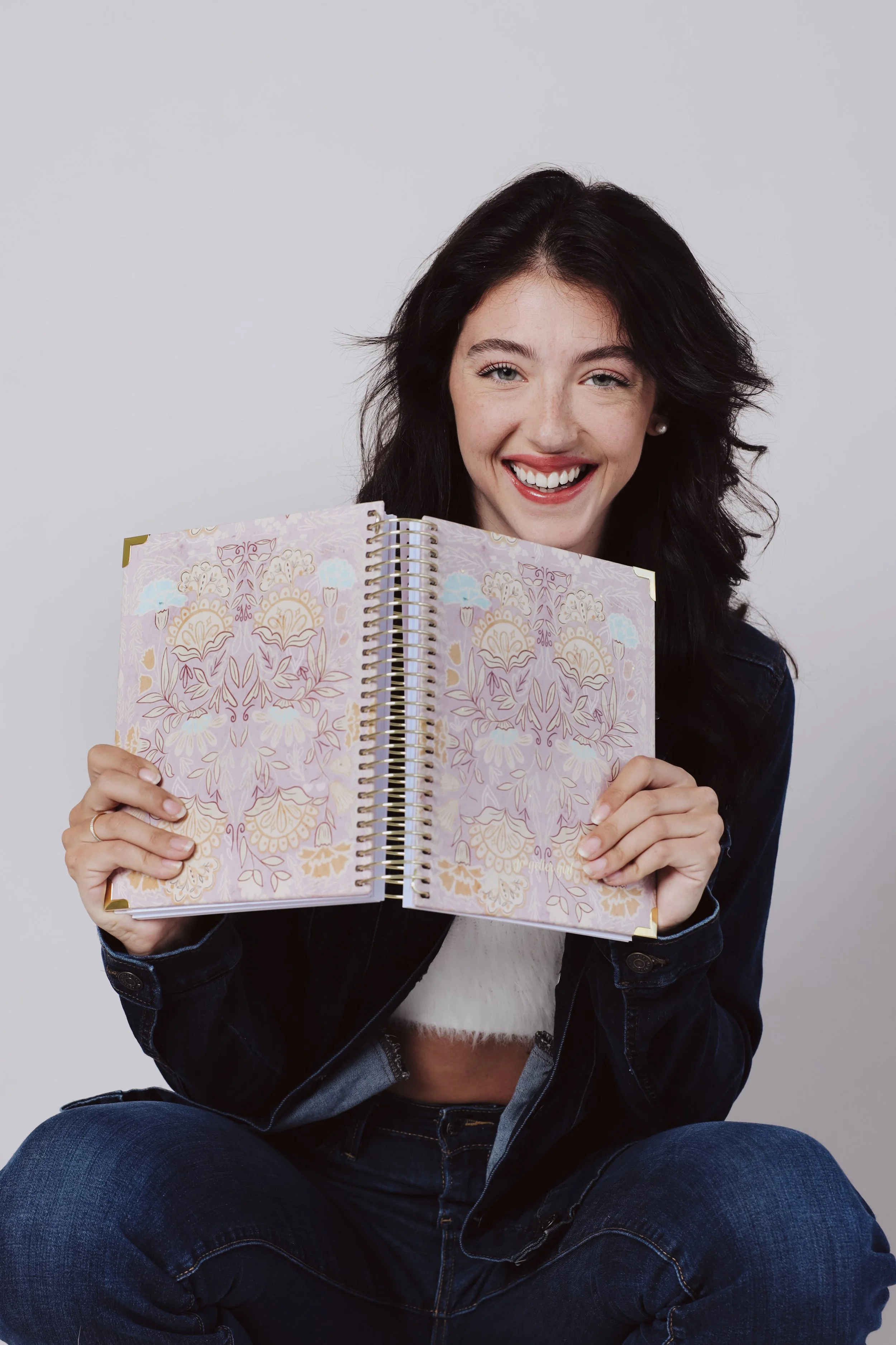
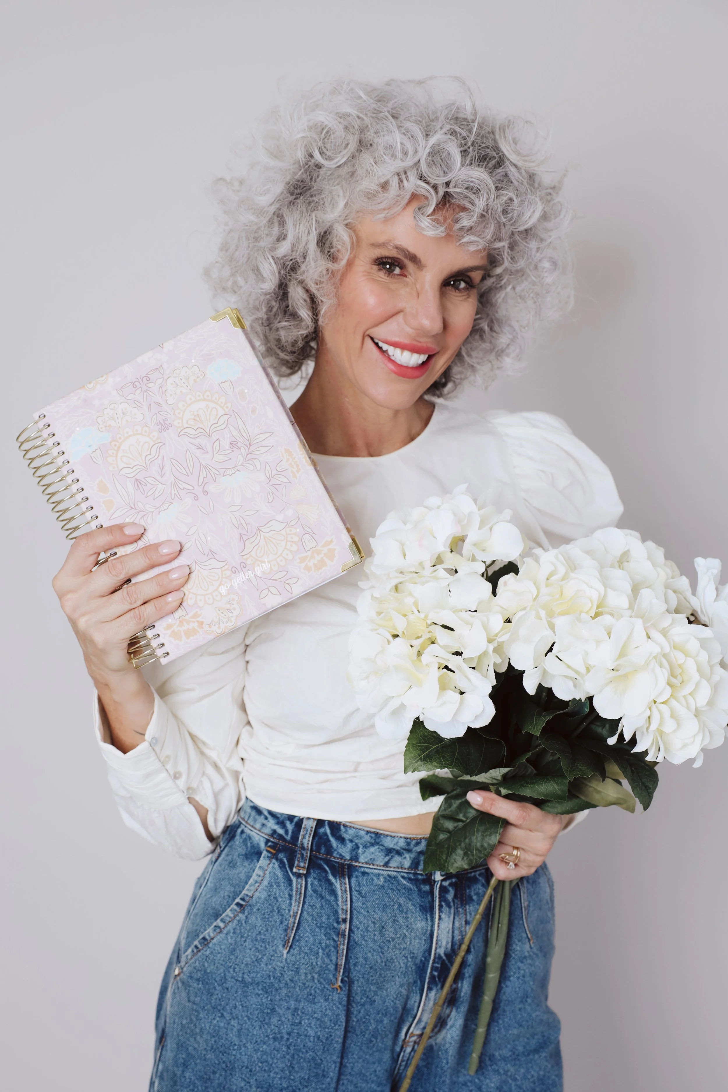
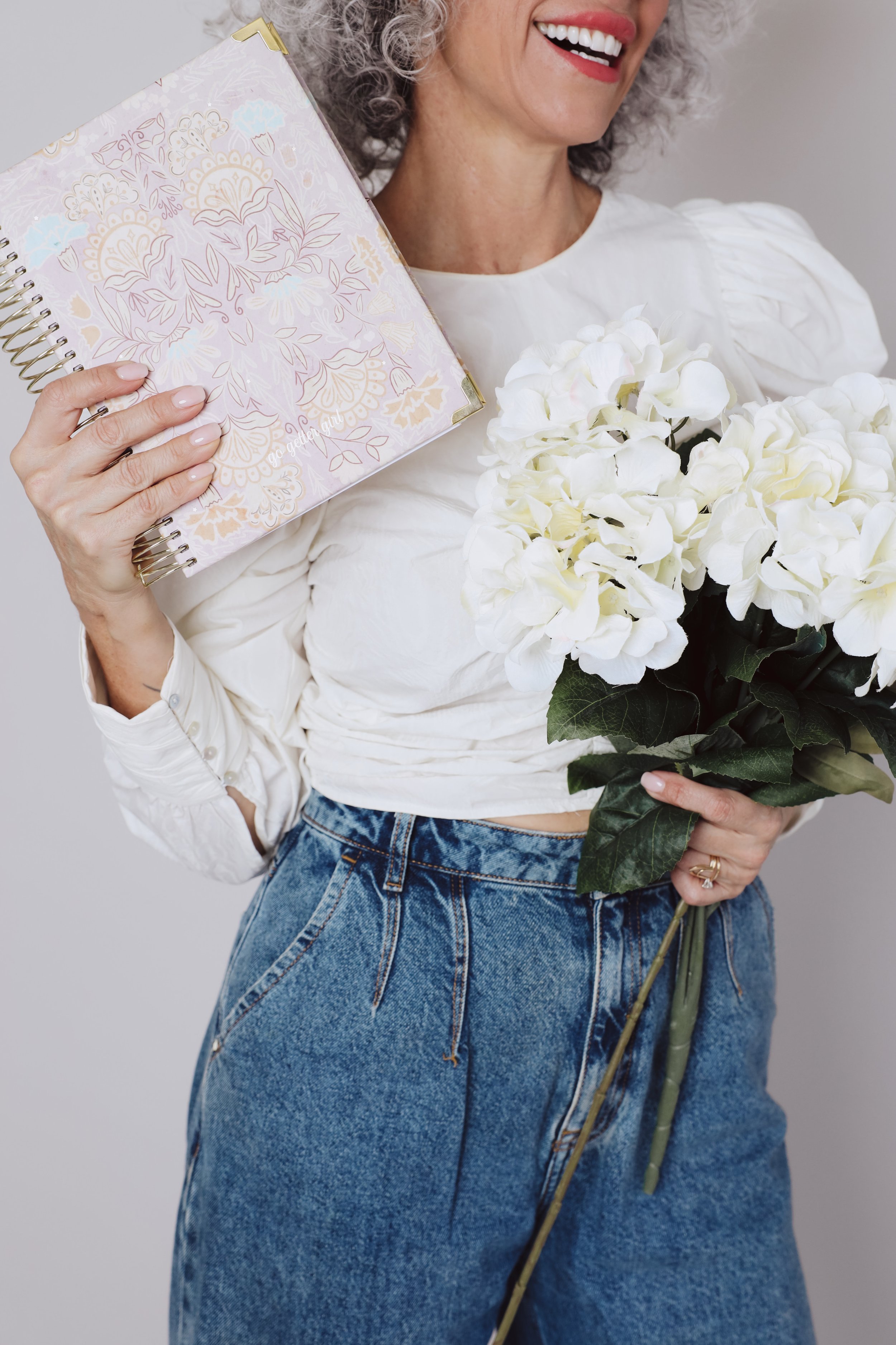
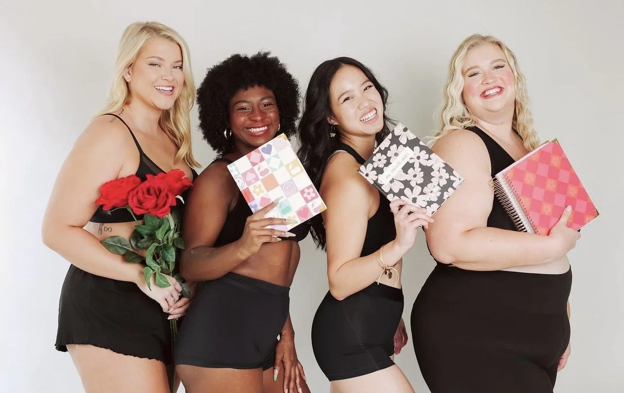
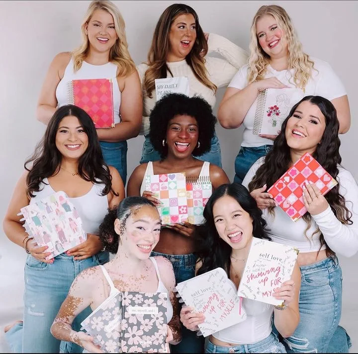
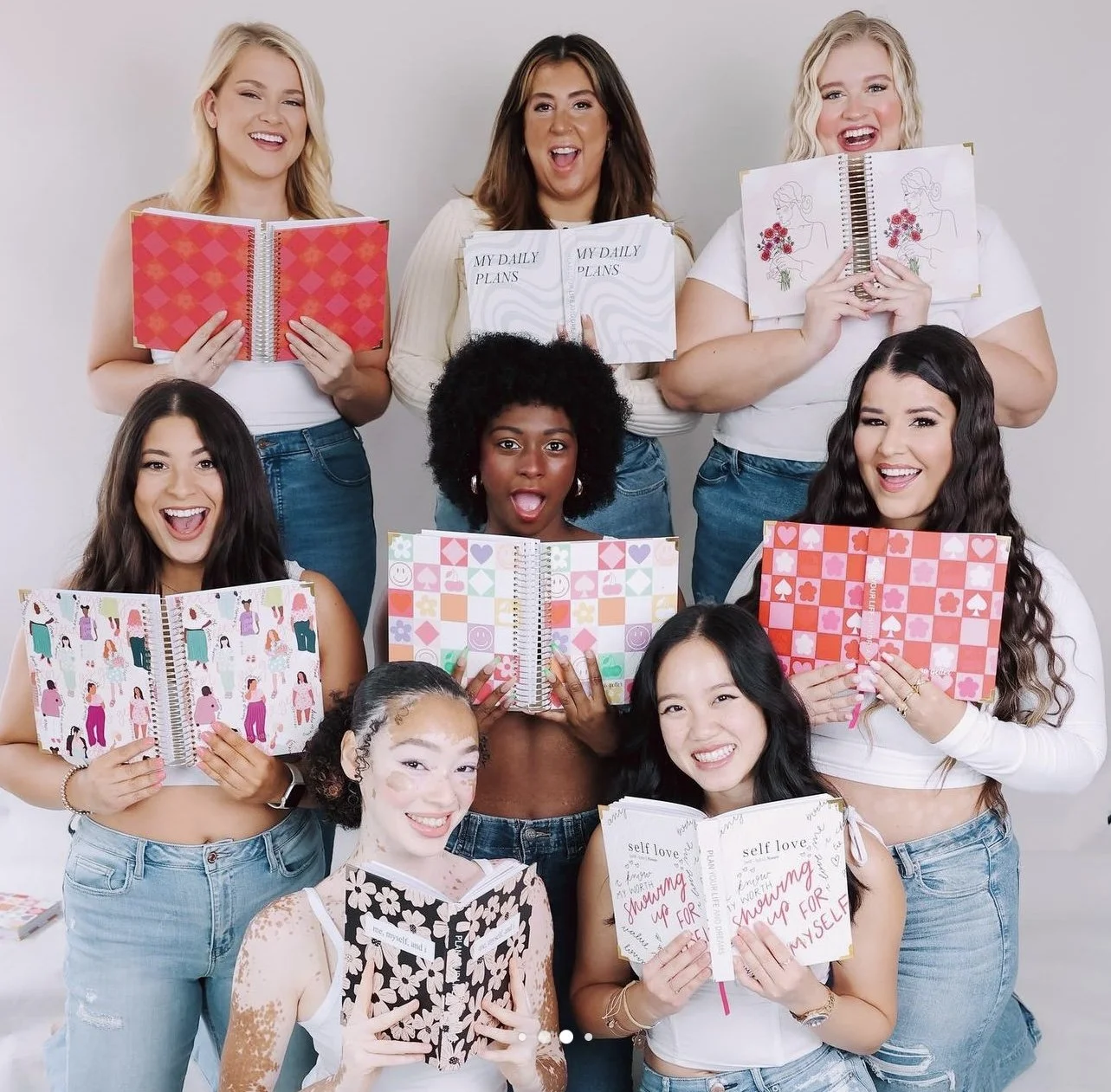
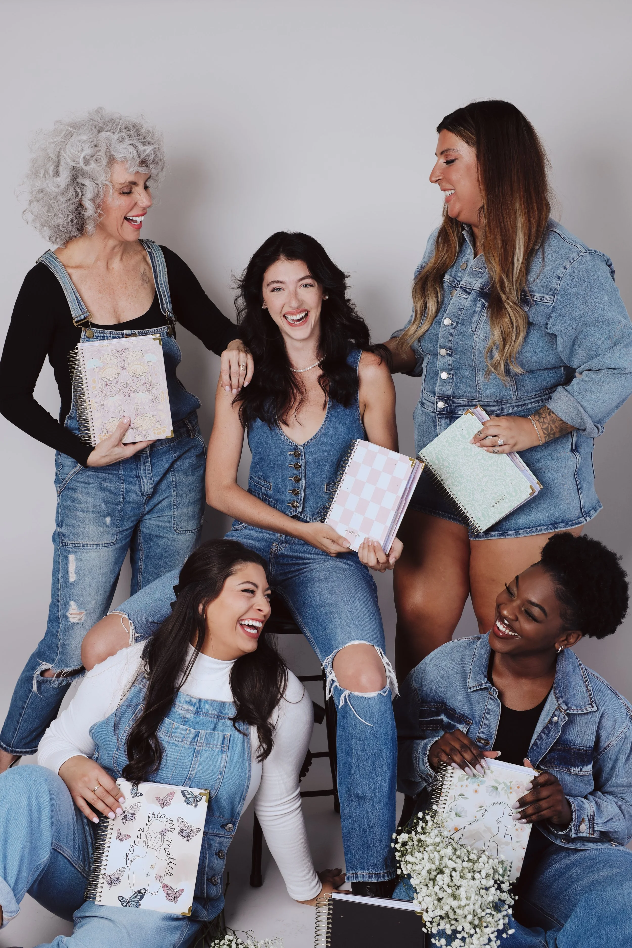
Launch Campaign & Brand Photography
Once production was finalized, the collections were brought to life through a beautiful and diverse launch shoot.
The planners were styled with:
Florals and textured fabrics
Vibrant backdrops
Real women representing the brand
Lifestyle imagery highlighting empowerment and confidence
Watching the designs move from flat illustrations to photographed products in the hands of real women was incredibly special. It wasn’t just about aesthetics. It was about representation and encouragement.
Why This Project Matters in My Portfolio
This project represents a major part of my surface pattern design and product design work.
It showcases:
Multi-collection concept development
Brand-aligned visual storytelling
Hand illustration for print
Manufacturing collaboration
Large-scale print production
Product launch design support
It also reflects something core to my design philosophy: creating work that feels meaningful, not just beautiful.
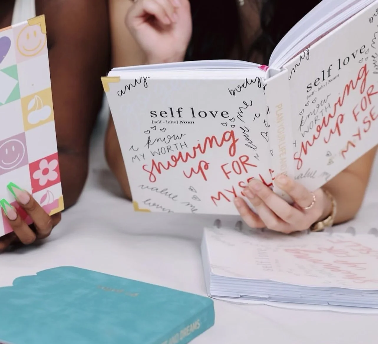
These planners weren’t just organized pages. They were daily reminders to show up for yourself.
Results: A Cohesive, Scalable Product Line
By designing two distinct but brand-aligned planner collections, Go Getter Girl was able to:
Expand its product offerings
Reach multiple aesthetic audiences
Strengthen brand identity
Launch a visually cohesive product line
The final collections felt intentional, elevated, and aligned with Rachel’s mission from start to finish.
Surface Pattern Design for Purpose-Driven Brands
Designing for Go Getter Girl reinforced how powerful thoughtful product design can be.
When surface pattern design is aligned with brand strategy and manufacturing expertise, the result is more than a product — it’s an experience. If you’re a founder looking to develop a physical product line, illustrated collection, or custom surface design for print, I’d love to collaborate. Because bringing a vision from sketch to shelf? That’s the magic of design!!!