NICKEL PLATE HERITAGE RAILROAD
SERVICES: BRAND DESIGN, SOCIAL MEDIA TEMPLATES, NEWSLETTER DESIGN
BRAND TRAITS: VINTAGE, HISTORIC, INDUSTRIAL, NOSTALGIC, COMMUNITY-CENTERED
INDUSTRY: NON-PROFIT


THE CHALLENGE
Nickel Plate Heritage Railroad (NPHR) is a nonprofit in Noblesville, Indiana, offering educational and entertainment outings around a historic rail line. Their experiences include the Nickel Plate Express (train excursions) and Nickel Plate Railbikes (a unique pedal-powered ride along the tracks). With deep community roots, they balance nostalgia, history, and fun, while contributing to local commerce and tourism.
In 2023, Nickel Plate Heritage Railroad launched Railbikes, a first-of-its-kind experience in Indiana that quickly became a viral sensation. Word spread fast through social media, local news, and community buzz. Tickets sold out, new audiences were discovering NPHR in droves—and yet, their brand wasn’t ready to keep up with the attention.
When curious visitors landed on the website or searched for information, they found:
Confusion about offerings — People came for Railbikes and only later realized there was also a historic train experience.
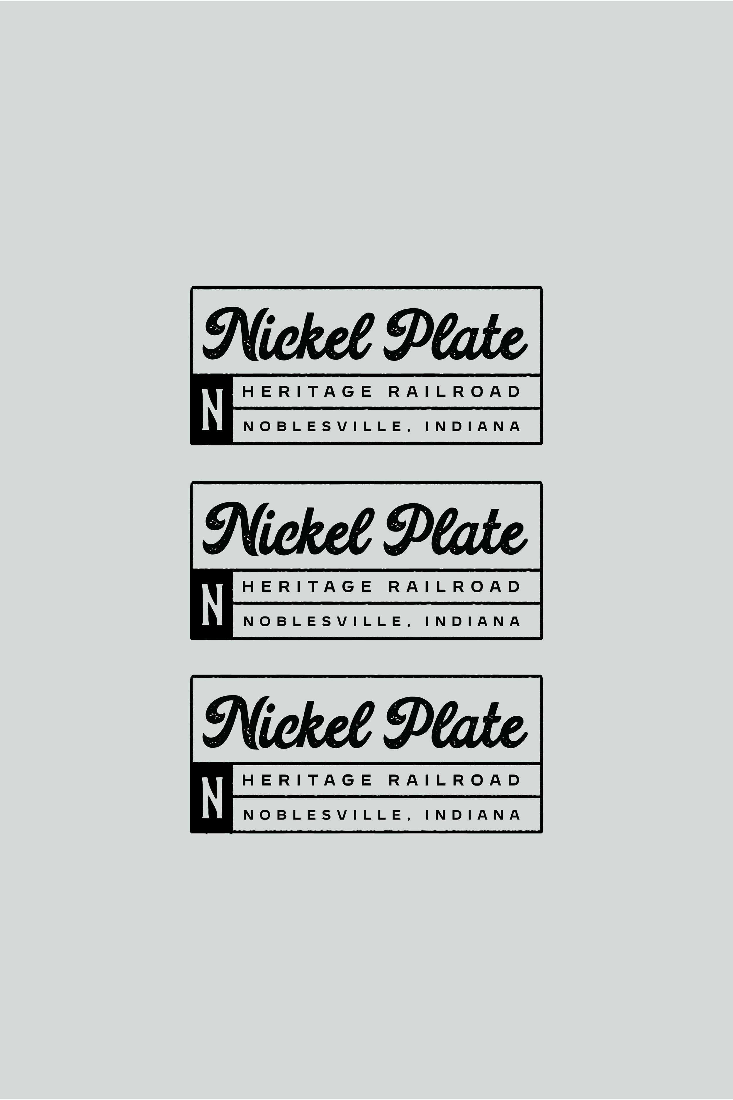
Mixed signals in branding — The organization was called “Nickel Plate Express” in some places, “Nickel Plate Heritage Railroad” in others, with press releases, signage, and social media all using slightly different names.
Mistaken identity — Guests thought they were affiliated with the City of Noblesville or even showed up at the Nickel Plate Hotel thinking it was the same business.
A limited visual system — Their existing logo and brand elements weren’t flexible enough for merchandise, signage, or digital-first marketing.
In short: their moment in the spotlight highlighted just how much they needed clarity, unity, and a scalable brand system to harness the momentum Railbikes had generated. Without it, they risked losing the trust and excitement of their growing audience.


THE SOLUTION
Our goal was to create a brand system that honored their heritage roots while giving them room to evolve and expand.
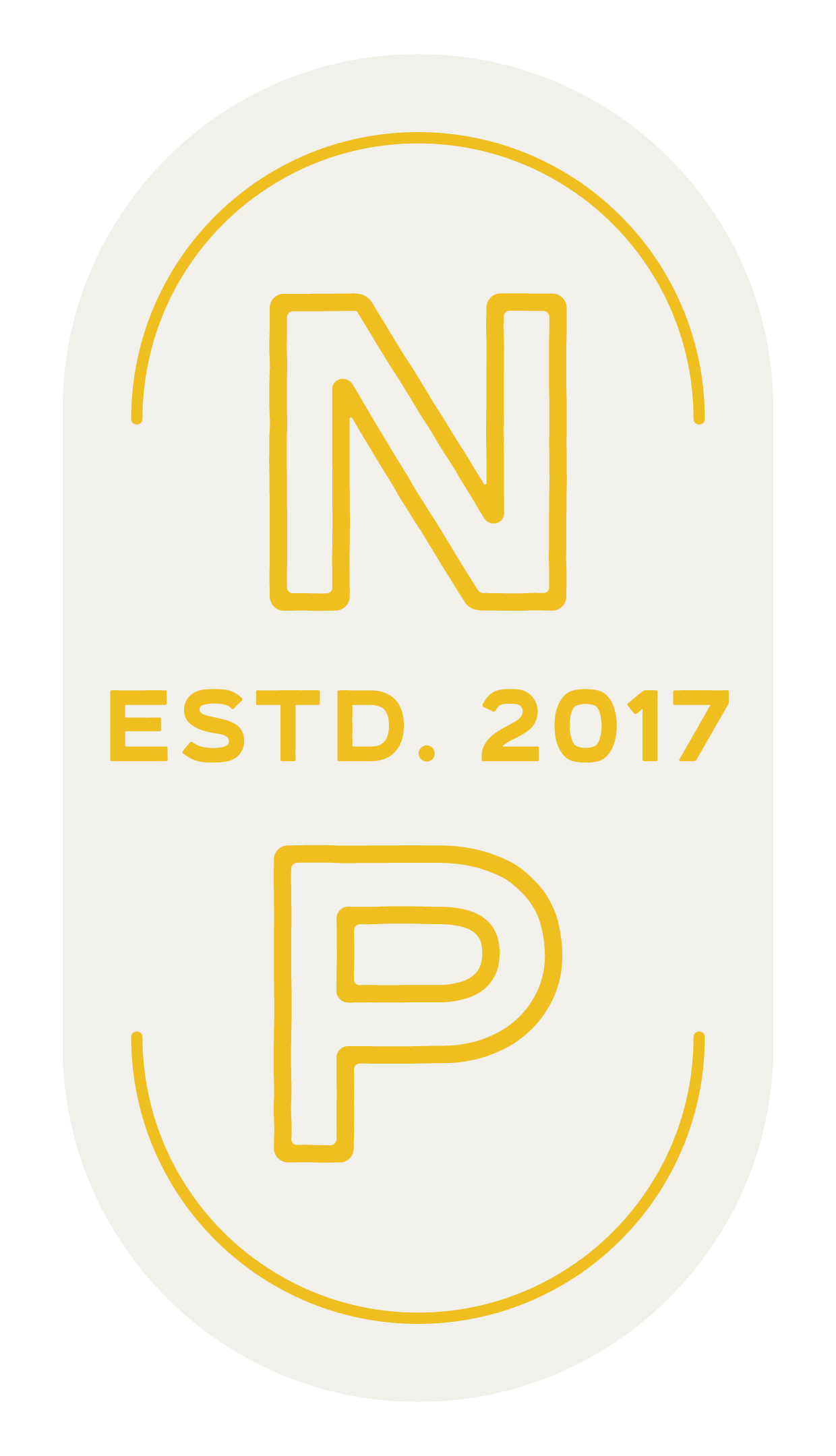
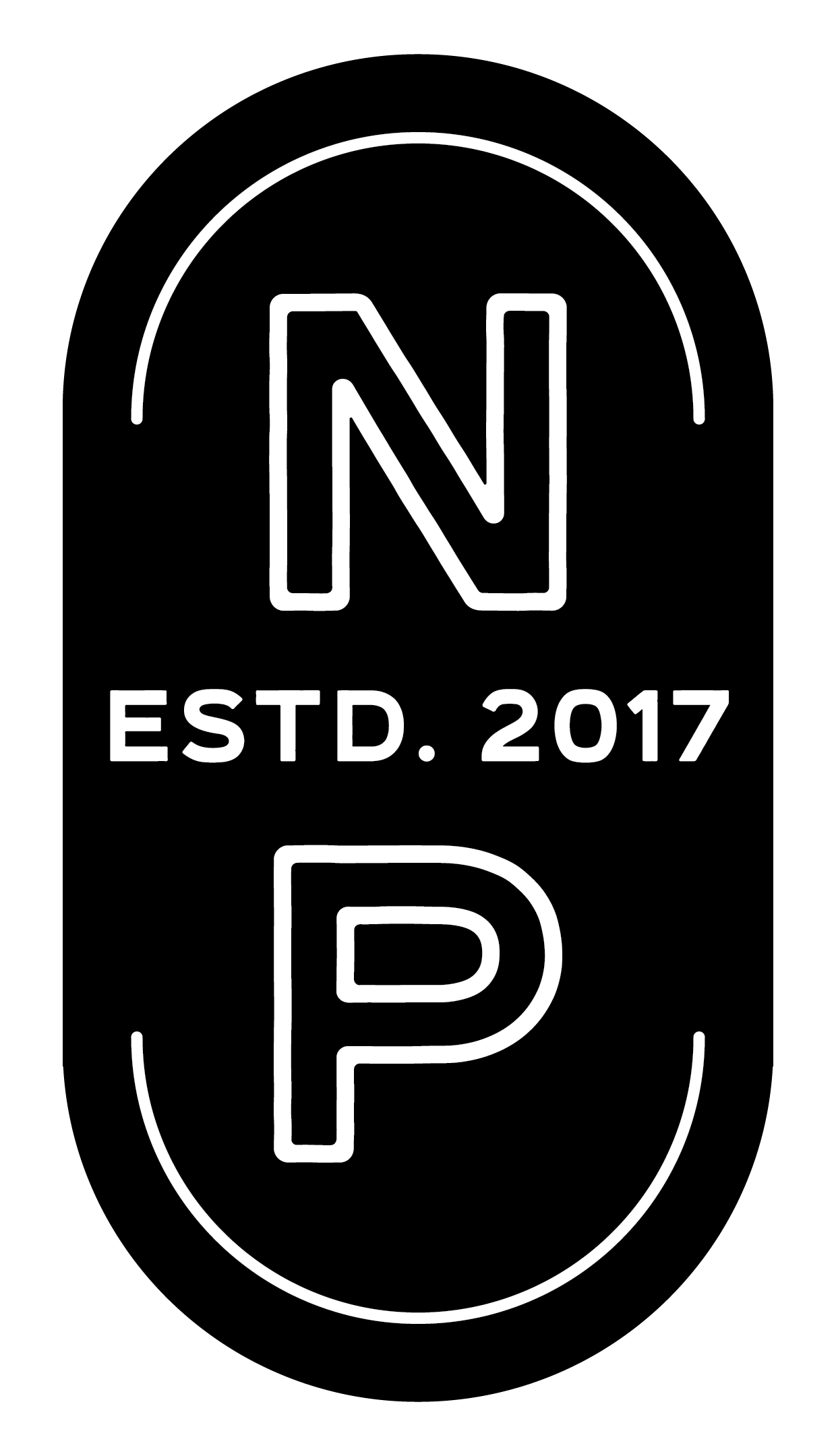
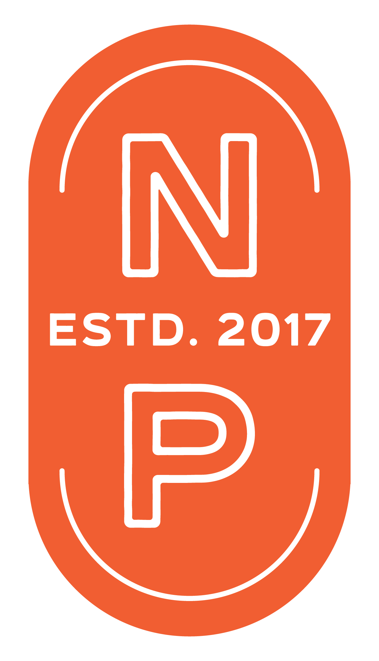
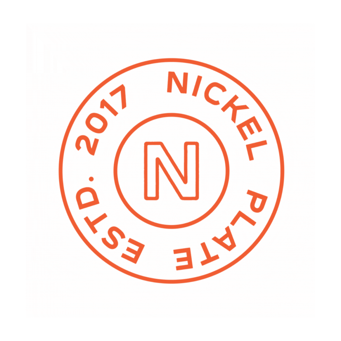
Unified Visual Identity: We developed a refreshed parent brand (Nickel Plate Heritage Railroad) with strong typography, vintage-inspired illustration, and versatile logo marks.
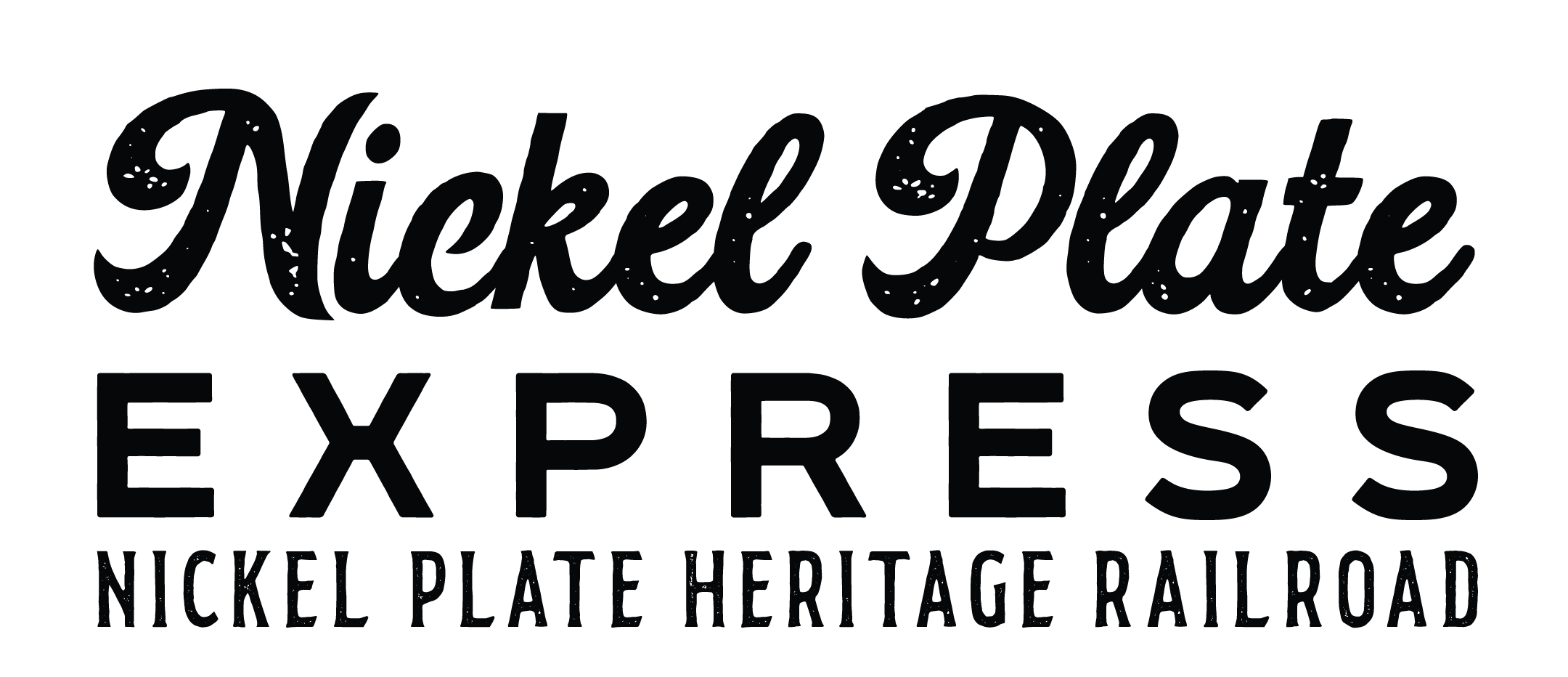
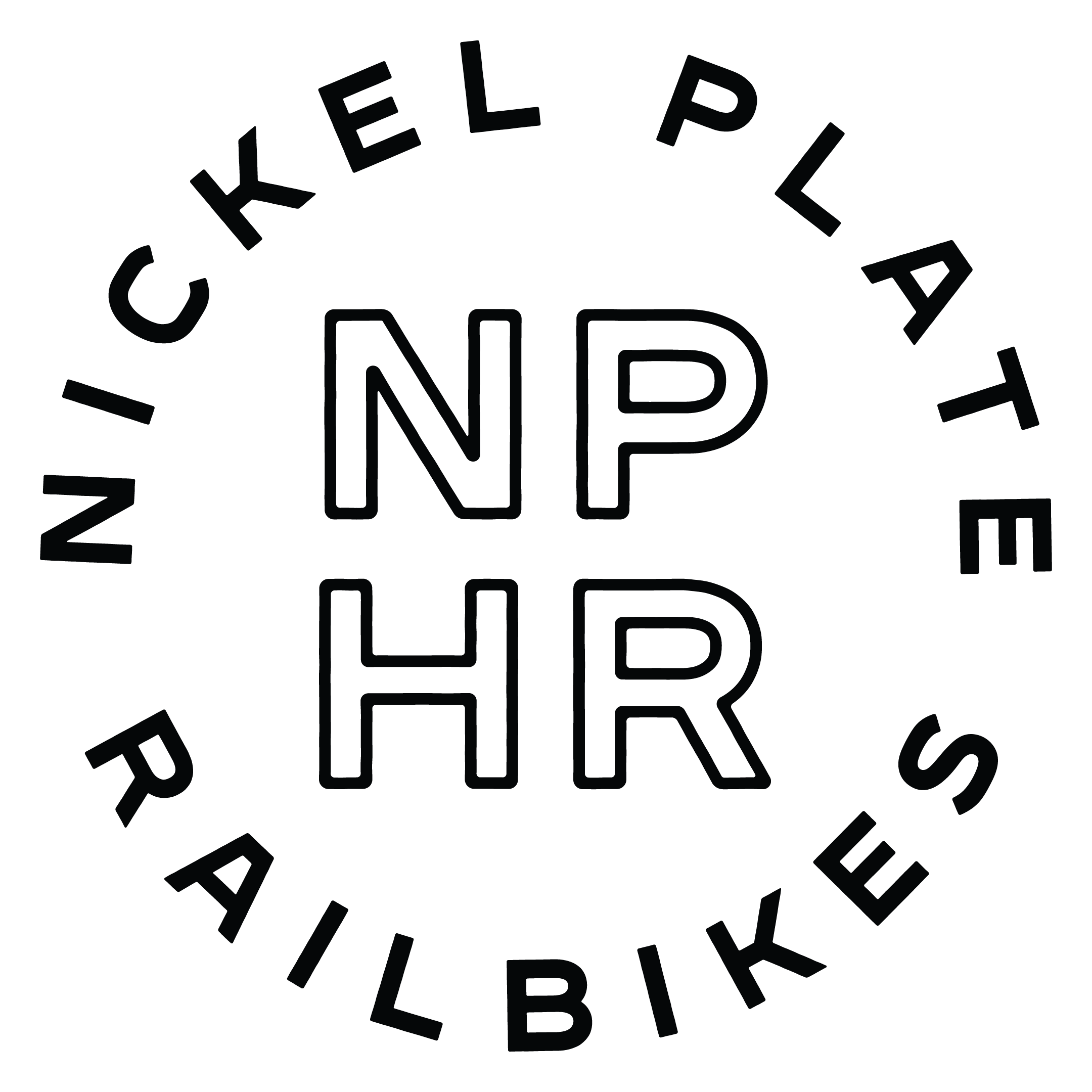
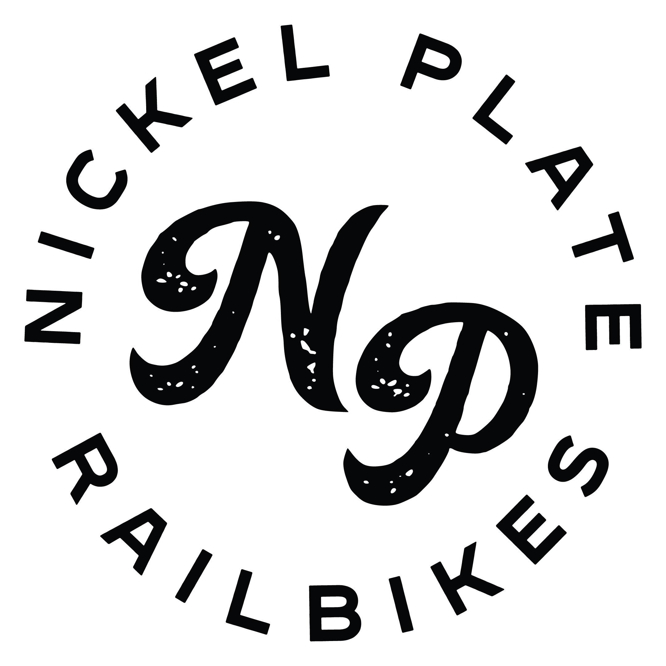
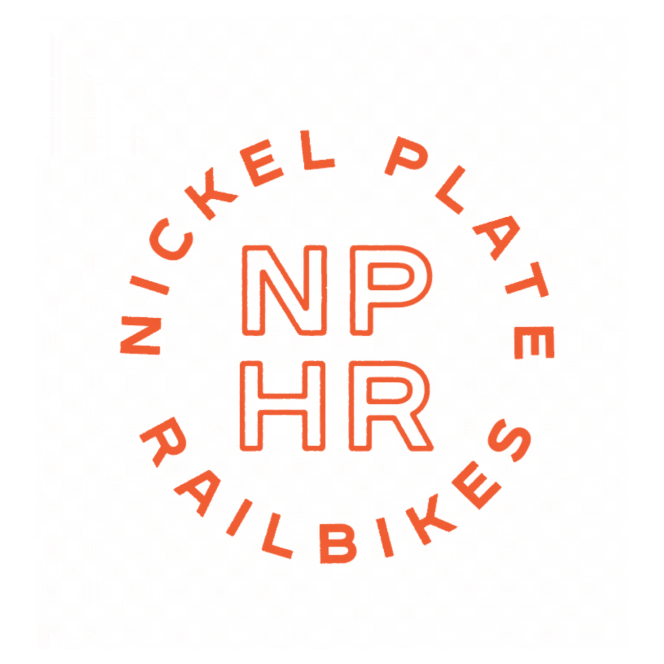
Sub-Branding: Created distinct but connected identities for Nickel Plate Express and Nickel Plate Railbikes. Each retained unique personality while tying back to the parent brand’s style.
Illustration & Iconography: Hand-drawn depots, trains, and railbikes add character and storytelling elements. These assets extend easily into merchandise, signage, and promotional materials.
Color Palette: Leaned into muted, vintage-inspired tones with nods to historic black + gold and touches of warm jewel tones for a nostalgic yet fresh feel.
Tone of Voice: Positioned NPHR as both educational and entertaining—a place where families can create traditions, enjoy approachable experiences, and feel at home.


THE RESULT
With a new brand system in place, Nickel Plate Heritage Railroad can now:
Confidently position themselves as an industry leader across Indiana rather than being mistaken for a local museum or city office.
Use consistent logos and visuals across ticketing, press releases, social media, and merchandise.
Differentiate their offerings while still tying them together under a cohesive umbrella brand.
Attract both locals and visitors with branding that reflects warmth, history, and adventure.
Instead of confusing customers, their visual identity now celebrates heritage while inviting new experiences—whether that’s sipping cider on the Express or pedaling a Railbike with friends.