THE WOMEN’S DIETITIAN
SERVICES: BRAND DESIGN, SQUARESPACE WEBSITE DESIGN
BRAND TRAITS: bold, feminine, embowering, playful, approachable
INDUSTRY: HEALTH + WELLNESS

THE CHALLENGE
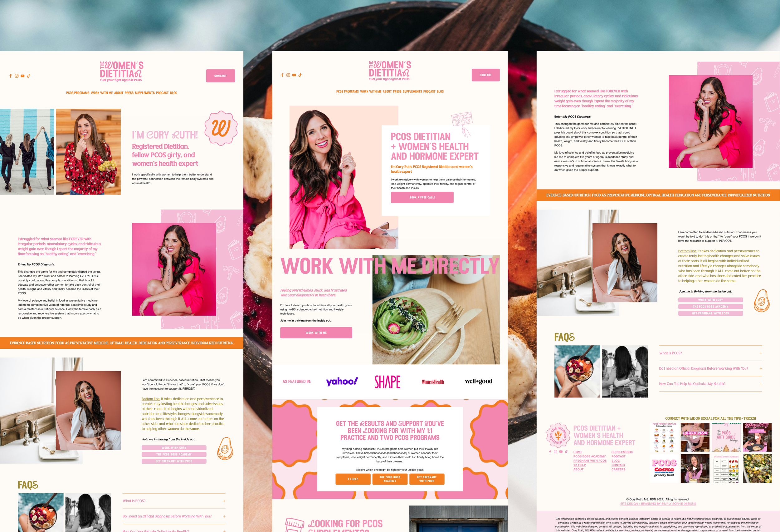
Cory Ruth is the go-to dietitian for women with PCOS—because she gets it, literally. As a registered dietitian who has PCOS herself, Cory has built her career helping women tackle the fertility and weight loss struggles that come with it. The only hiccup? Her branding was all over the place! With a jumble of fonts and no clear identity, her marketing just wasn’t shining like it should.
Cory’s got a bold, big-sister energy that lights up her Instagram, but her black-and-white, personality-free website? Not so much. Cory knew it was time for a major upgrade if she wanted to stand out and connect with her ideal audience.
So, we gave her branding a total makeover—bright, bold, and totally empowering, just like her! Then, we took her website from “meh” to “wow” with a vibrant, user-friendly redesign that makes it a breeze for her 500K+ followers to browse, buy her courses, and inquire about 1:1 coaching. No more worrying about a website that doesn’t reflect her vibe! Now, Cory can confidently send her audience to a site that feels just as awesome as she is, and she’s ready to turn those followers into clients with ease.


THE RESULT
A vibrant, bold brand featuring eye-catching color combinations and hand-drawn illustrations that bring the health and wellness industry to life in an approachable yet empowering way, paired with a dynamic, engaging website that's as easy to navigate as it is visually captivating, creating a seamless experience for users.

CLIENT LOVE NOTE
“Working with Simply Sophie Designs was a dream come true. I have never had a website I actually LOVED and was proud of until now. Sophie carried out my vision perfectly, was extremely responsive, prompt, and professional, and and overall just knocked it out of the park. I would work with her again in a HEARTBEAT.”
CORY RUTH, RD, THE WOMEN’S DIETITIAN