
Colorful Logo & Brand Design For A Christian Author & Personal Brand
SERVICES: BRAND DESIGN, WEB DESIGN, COPYWRITING, STRATEGY
BRAND TRAITS: bright, joyful, uplifting, warm, whimsical, personal
INDUSTRY: AUTHOR, PODCASTER + SPEAKER

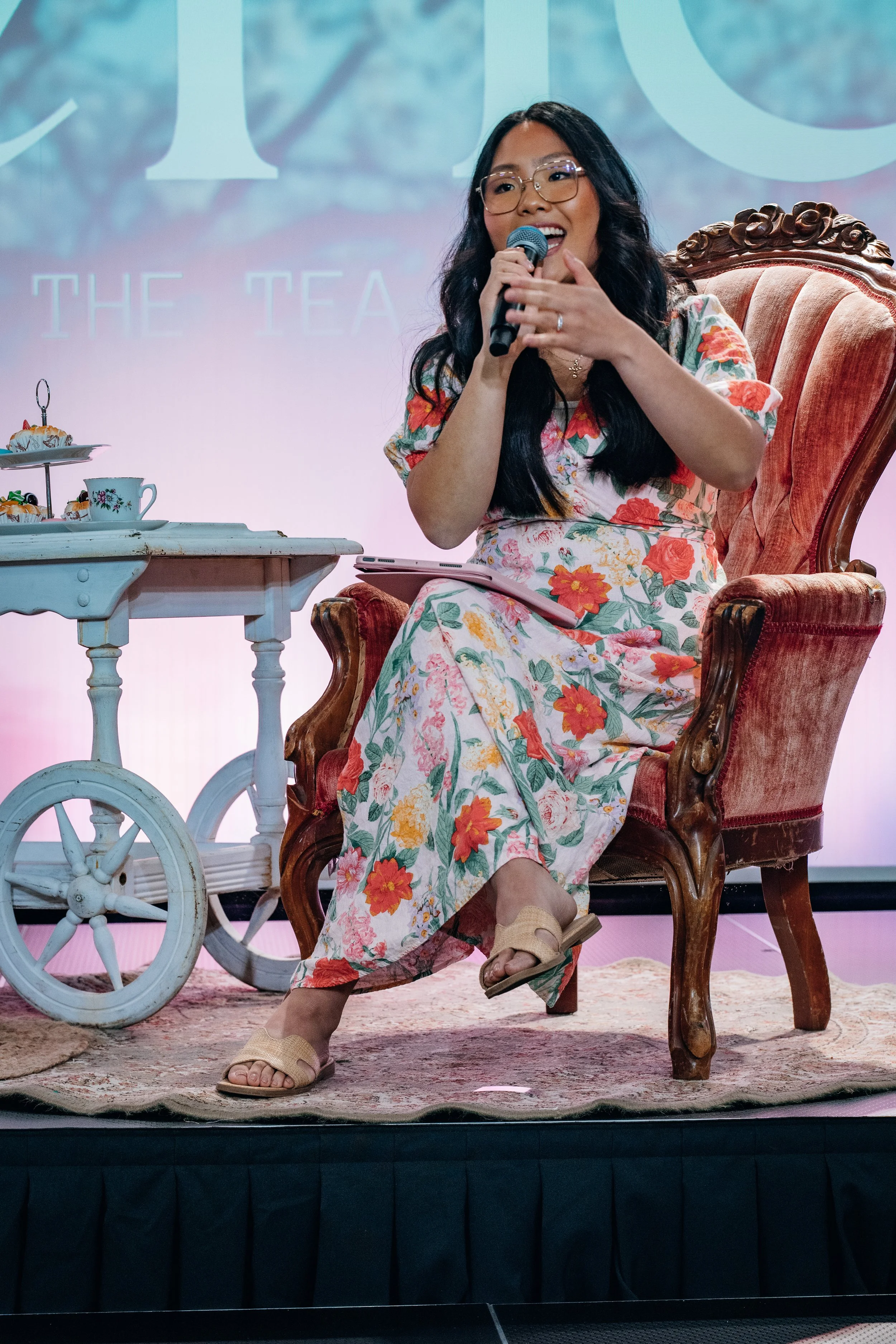

Personal Brand Strategy, Website Design & Copywriting For Tara Sun
Tara Sun is a best-selling author and podcast host leading a bold, joy-filled movement of women who want deeper faith in Jesus without overwhelm. What started as a free WordPress blog while she was in Bible school has grown into a ministry helping women uncomplicate Scripture and live out God’s Word in the middle of real life (yes, even the dishes, laundry, and motherhood).
As her audience and impact grew, Tara felt frustrated that her personal brand didn’t have a clear style — and she knew it was time for a cohesive brand identity and Squarespace website design that would support her ministry and everything she’s building. Together, we created a bright, joy-filled brand rooted in thoughtful brand strategy, complete with a flexible design system that feels warm, whimsical, and trustworthy across every touchpoint.


The Brand Identity Vision For This Author & Podcaster Brand: Colorful, Personal & Encouraging
Tara is all about helping women uncomplicate Scripture and move from surface-level faith to something living, active, and deeply personal. Her message focuses on biblical depth and practical encouragement — meeting women in the middle of busy seasons filled with motherhood, work, relationships, and everyday responsibilities. She wanted her brand to feel joyful, warm, whimsical, and encouraging — cozy and bold at the same time.
But her old branding felt rigid and inconsistent. It lacked a clear visual style, didn’t feel professional, or reflect the level of authority she carries as an author and podcaster.
So we gave her a full glow-up: A cohesive brand identity with the following assets:
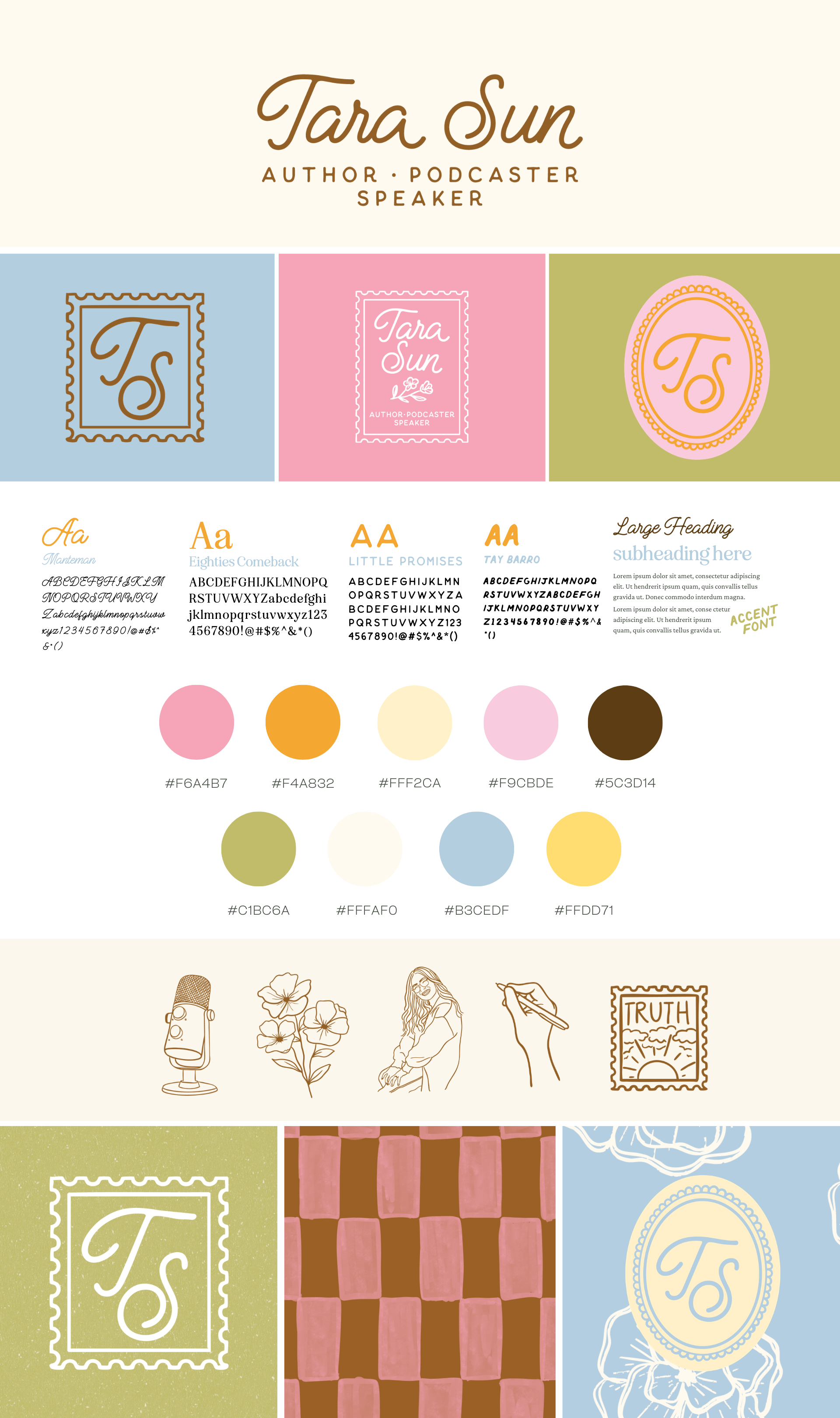
Logo Suite
Primary Logo
Secondary Logo
Submarks
Hand-Illustrated Branded Icons
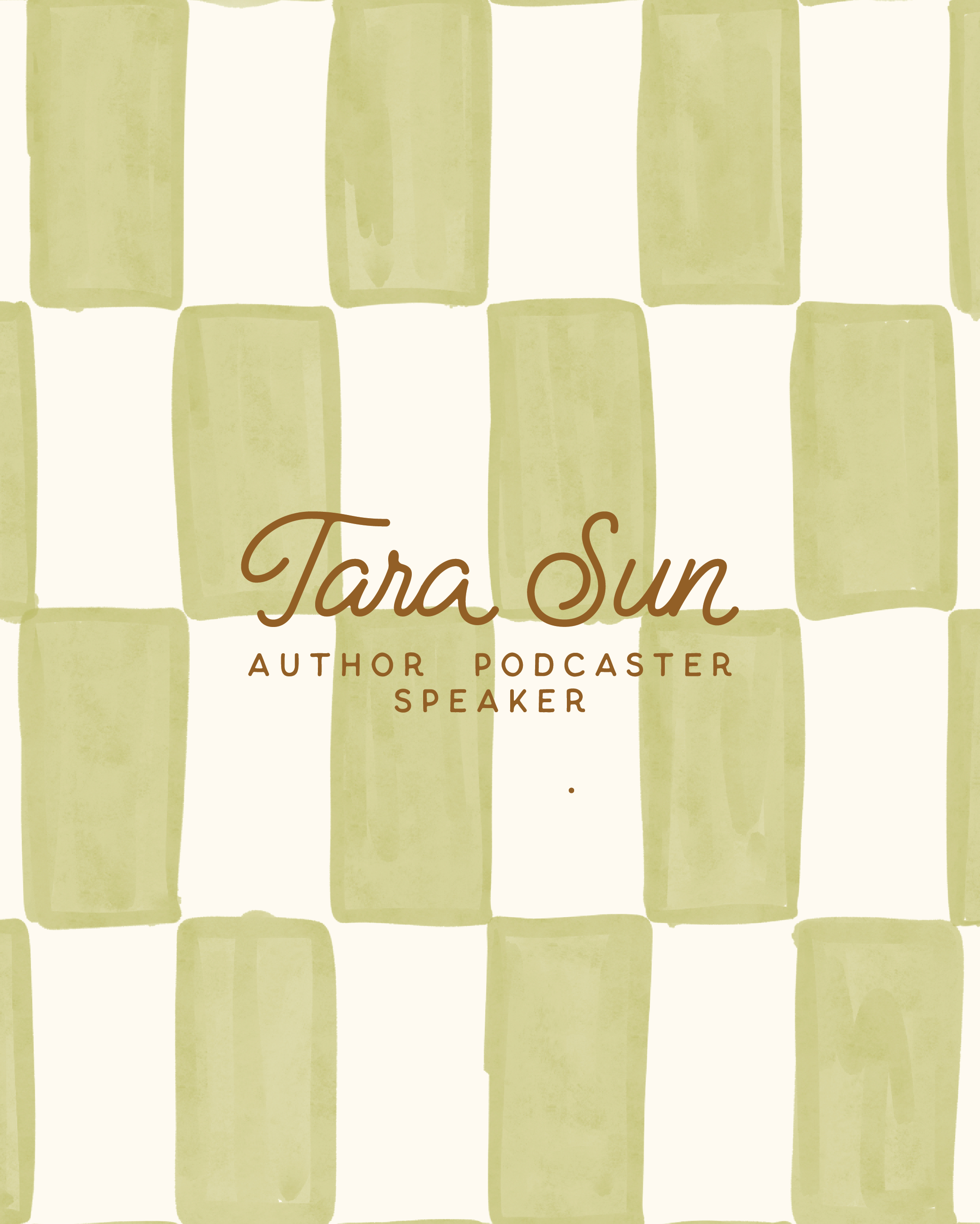
Custom Brand Patterns + Backgrounds
Custom Squarespace website
Custom written website copy
Positioning her personal brand with credibility and confidence.
Through thoughtful typography pairings, a fresh color palette of pinks, yellows, and natural greens, hand-drawn illustrations, and a flexible logo suite, we built a design system that flows seamlessly across her books, podcast, social media, and shop — creating consistency at every touchpoint and supporting long-term growth.


How We Leveled Up This Christian Author & Personal Brand
Tara had the message, the momentum, and the audience. She just needed a cohesive visual identity to support the level of ministry she was stepping into.
She felt frustrated that her brand lacked a clear style. It felt rigid. Inconsistent. Not reflective of the warmth and clarity of her teaching. As her books, podcast, speaking engagements, and shop continued to grow, she needed a brand system that could carry it all with confidence.
This rebrand was built to:
Reflect her heart for biblical truth and modern discipleship in a way that feels timeless and approachable
Capture her personal voice through a cozy, hand-drawn aesthetic that mirrors her writing and podcast tone
Establish a flexible design system that flows seamlessly across her website, podcast graphics, social media, course materials, and merchandise
Every element was designed to communicate warmth, trust, and faith-filled encouragement at first glance while positioning her with the credibility of a national author and speaker.
Now, her visuals reflect both sides of her brand. The joyful, colorful, whimsical personality that draws women in and the biblically rich teaching that keeps them rooted in truth.
THE PROCESS
Ever wonder what it’s like to work with a brand designer? Every project begins with onboarding and research. Once Tara officially booked, she completed both a brand and website questionnaire so I could fully understand her audience, goals, competitors, and long-term vision. This phase is all about clarity. Before we design anything, we define exactly what the brand needs to communicate and where it’s headed. Strategy first. Always!
From there, we move into creative direction. I create curated mood boards that explore color, typography, texture, and overall aesthetic direction. This is where the personality starts to take shape! It helps us visually align before building anything so we are not guessing. We are designing with intention. Once we finalize the direction, the real design work begins!
Next comes brand development. I build out the full logo suite, color palette, typography system, and supporting design assets. Every element is intentional and designed to function across multiple platforms, not just look pretty in one place. This is the behind-the-scenes phase full of drafts, refinements, and strategic decisions.
And then… Brand Reveal Day!!!
This is when I deliver the full in-depth brand presentation and walk through every logo variation, font choice, color decision, and design element. Clients see their brand brought to life in real-world mockups across their website, social media, products, and more. It is the moment everything clicks. The strategy makes sense. The vision feels tangible. And the brand finally feels solid, cohesive, and ready to be seen. From there, we transition into website design with a clear visual foundation and cohesive system already in place.


Key Brand Design Decisions
Tara’s previous website felt muted, beige-heavy, and visually…rigid. While it worked, it did not reflect the warmth, joy, and bold encouragement she is known for. The goal of this rebrand was not to erase her identity, but to elevate it.
Logo Suite
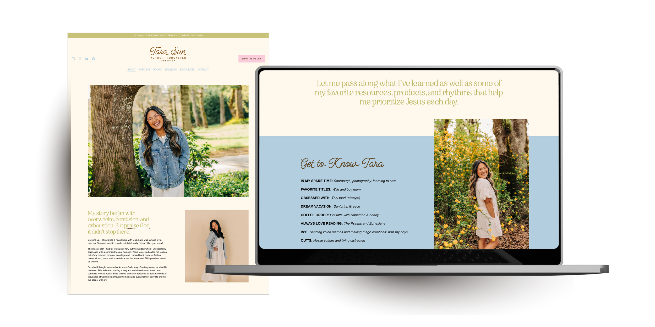
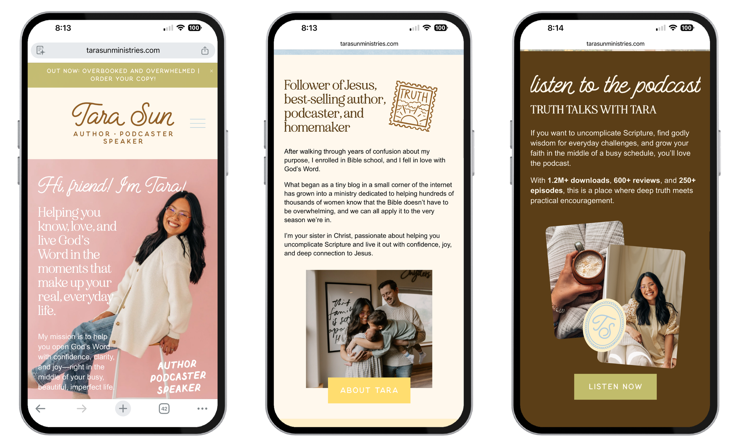
We designed a complete logo suite that feels feminine, confident, and versatile. Her primary logo centers her name in a script that feels personal and approachable, balanced by a structured serif that adds credibility and editorial polish.
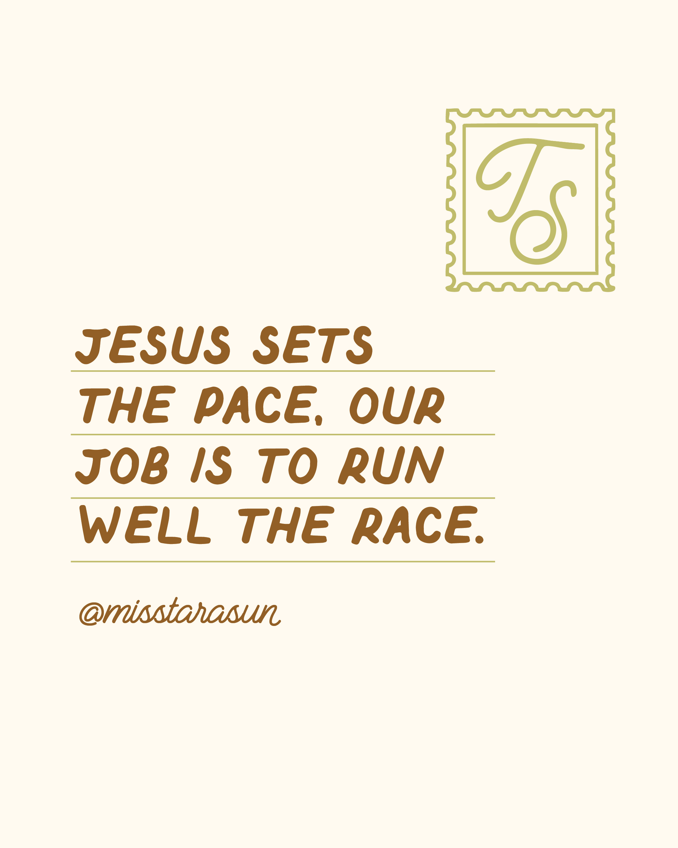
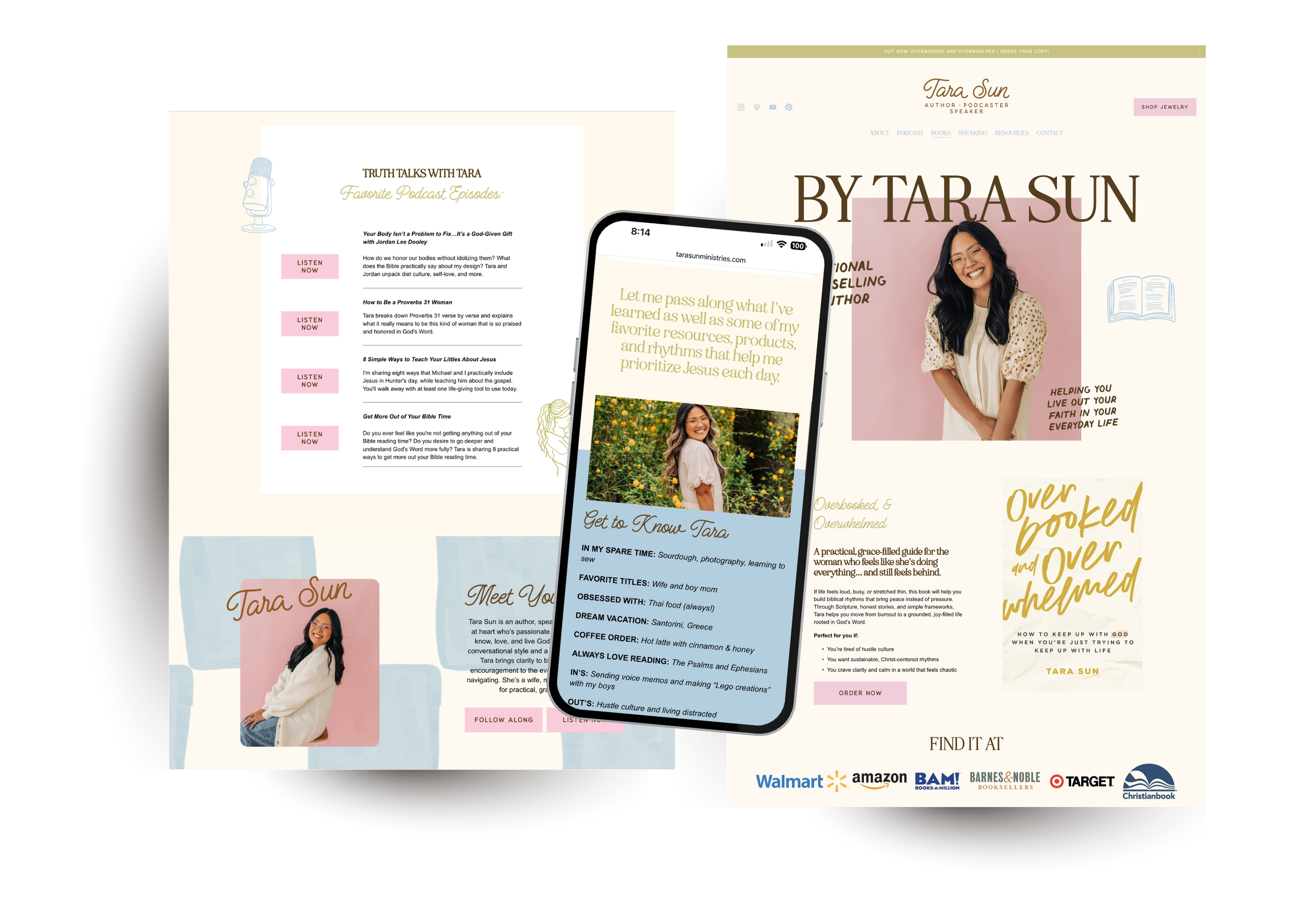
One of the most meaningful elements in the brand is the stamp-style logos. These are designed to symbolize her role as a messenger. She is quite literally carrying and delivering a message through her books, podcast, and teaching. The stamp motif reinforces that idea visually. It also gives her brand a timeless, collectible quality that works beautifully across print, digital graphics, and merchandise.
The secondary logos and submarks give flexibility across all platforms. Whether it’s a podcast cover, Instagram graphic, book launch page, or jewelry packaging, the identity adapts seamlessly without losing recognition.
Typography
Typography played a huge role in balancing personality with authority. Her script font is expressive and feminine, perfect for headings and moments where warmth matters most. It gives her brand that personal, handwritten feel without sacrificing legibility.
The serif font adds structure and an editorial edge. It is highly readable and brings maturity and polish to longer content. This is especially important for an author whose work centers around teaching and clarity.
We also incorporated multiple supporting fonts:
A clean font for the “author, podcaster, speaker” line that translates beautifully into buttons and subtle accents
A handwriting-style accent font that pairs naturally with the artistic Instagram graphics she already creates
Together, these fonts create a layered typographic system that reflects her voice: approachable yet serious about truth.
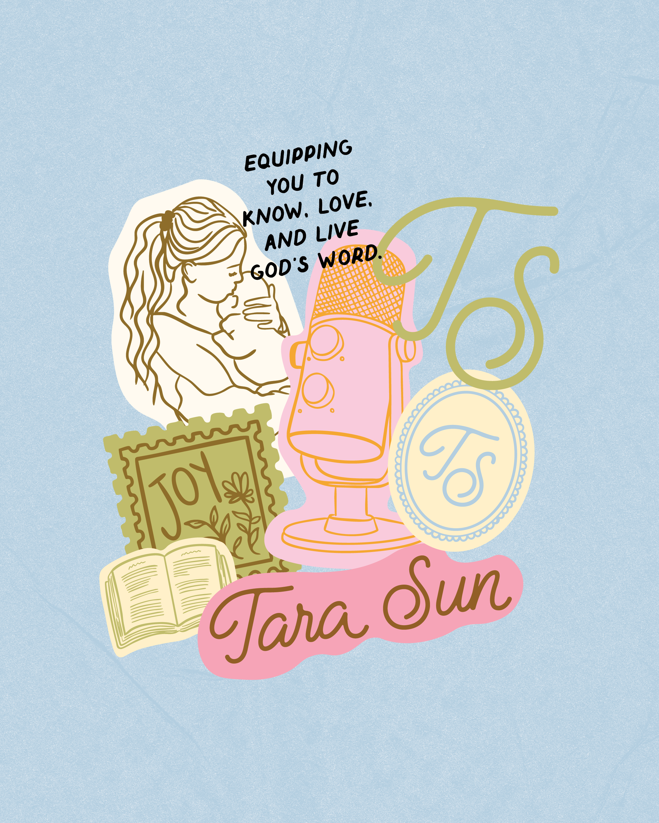
Illustrations & Design Assets
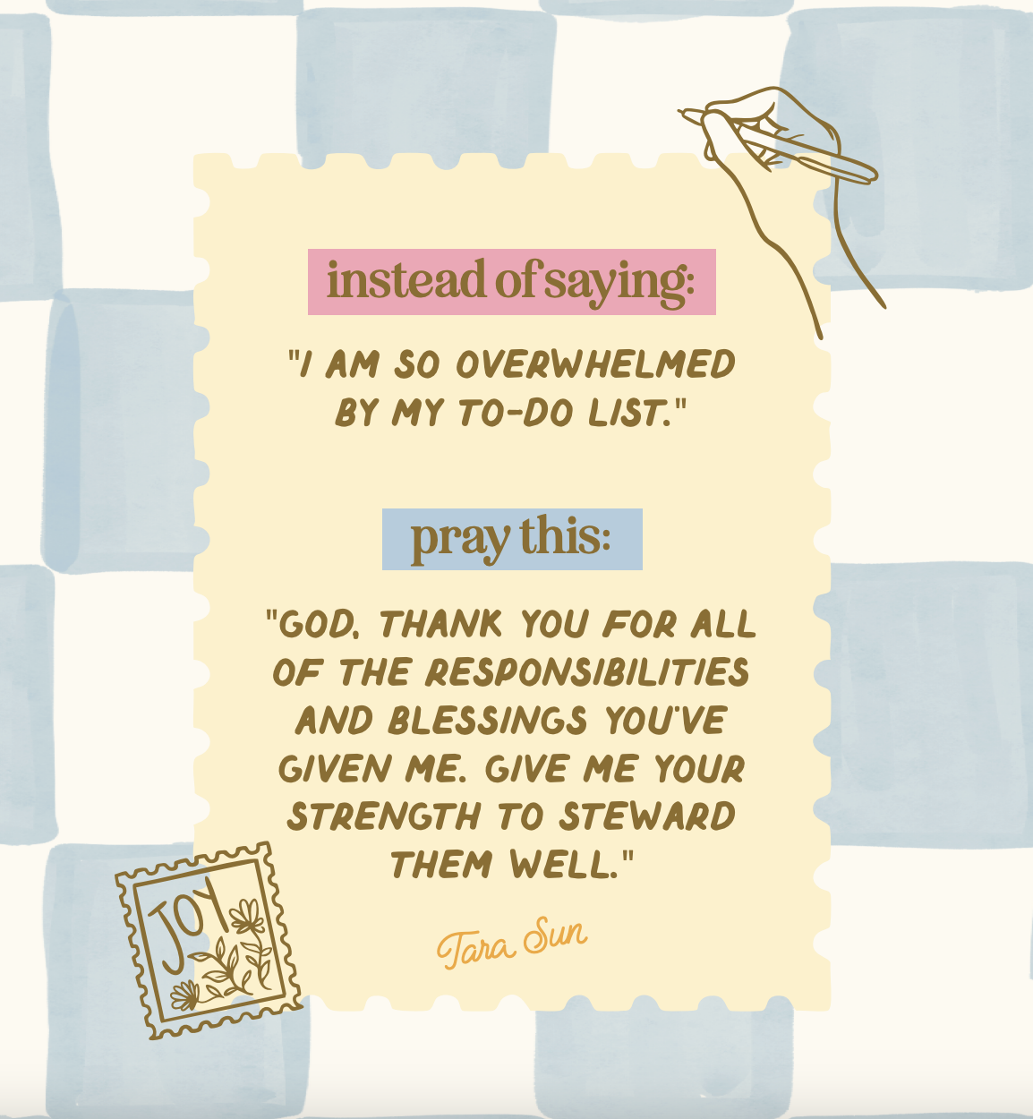
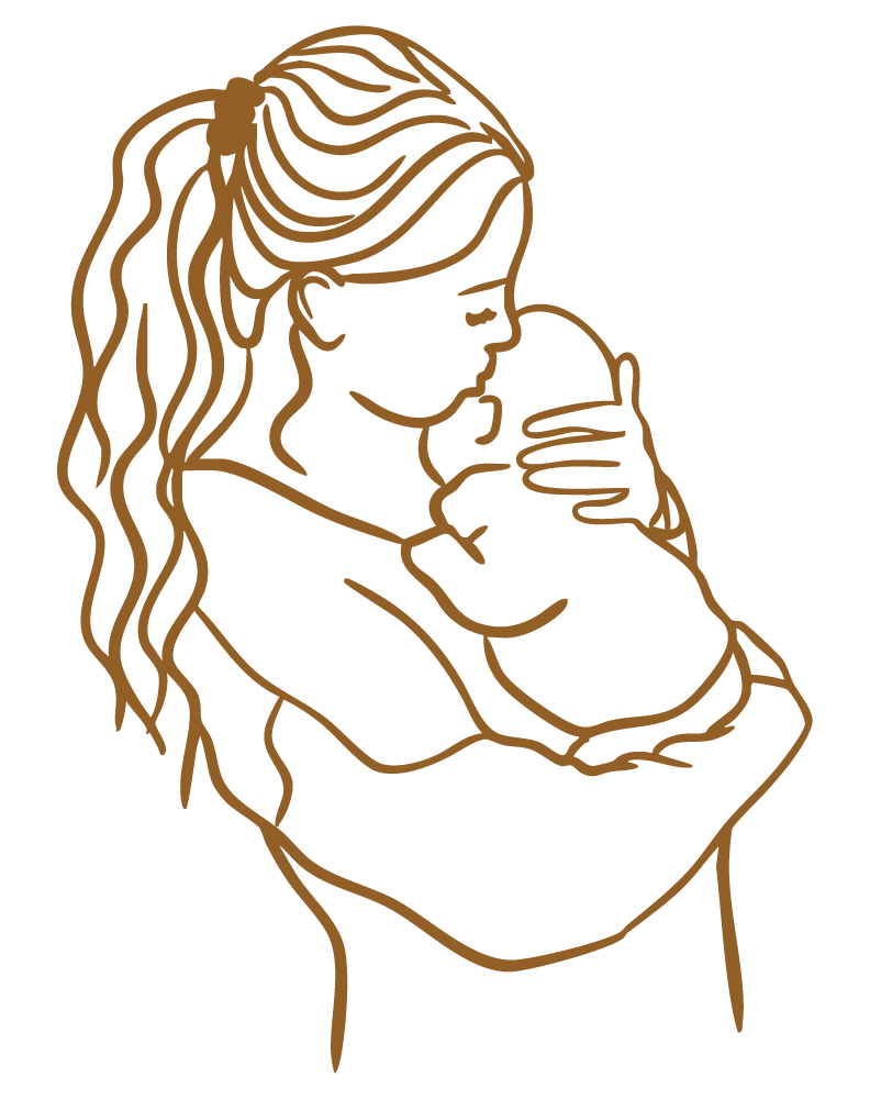
The hand-drawn illustrations and icons add personality and humanity to the brand. Florals, the microphone, the open Bible, the stamp marks, and the framed elements all reinforce her message visually.
These assets are not decorative filler. They give her content movement and recognizability across platforms. They support her cozy, encouraging tone while creating consistency across website, social, podcast graphics, and products.
The Transformation
Comparing her previous muted, minimal layout to the new identity, the difference is clarity and energy. The updated brand feels alive. It reflects the joy, encouragement, and bold truth she is known for, while giving her the structure and credibility she wanted.
Now her visuals match the strength of her message!


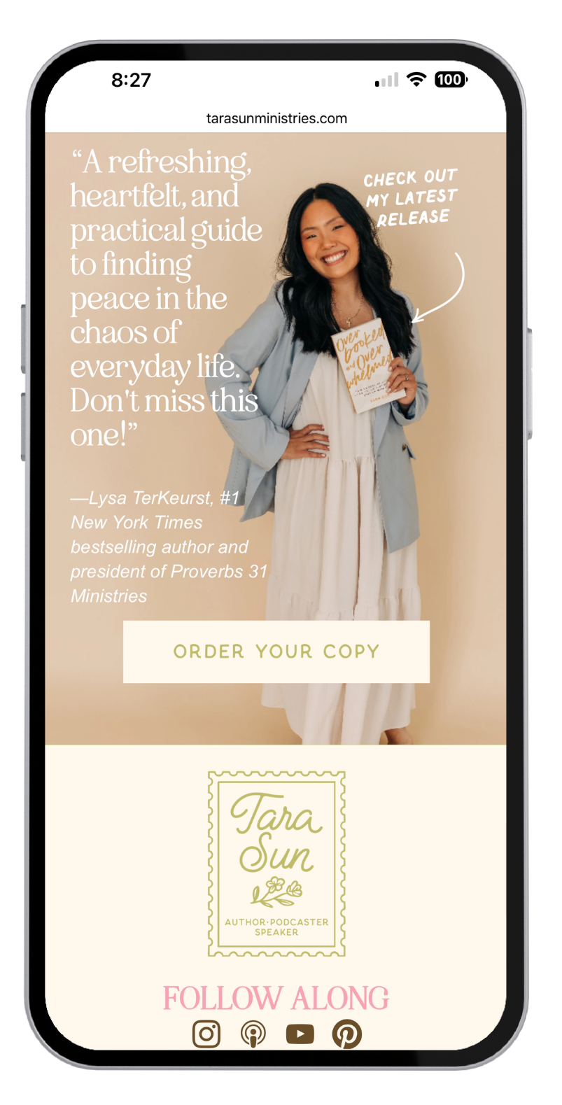
Squarespace Website Design
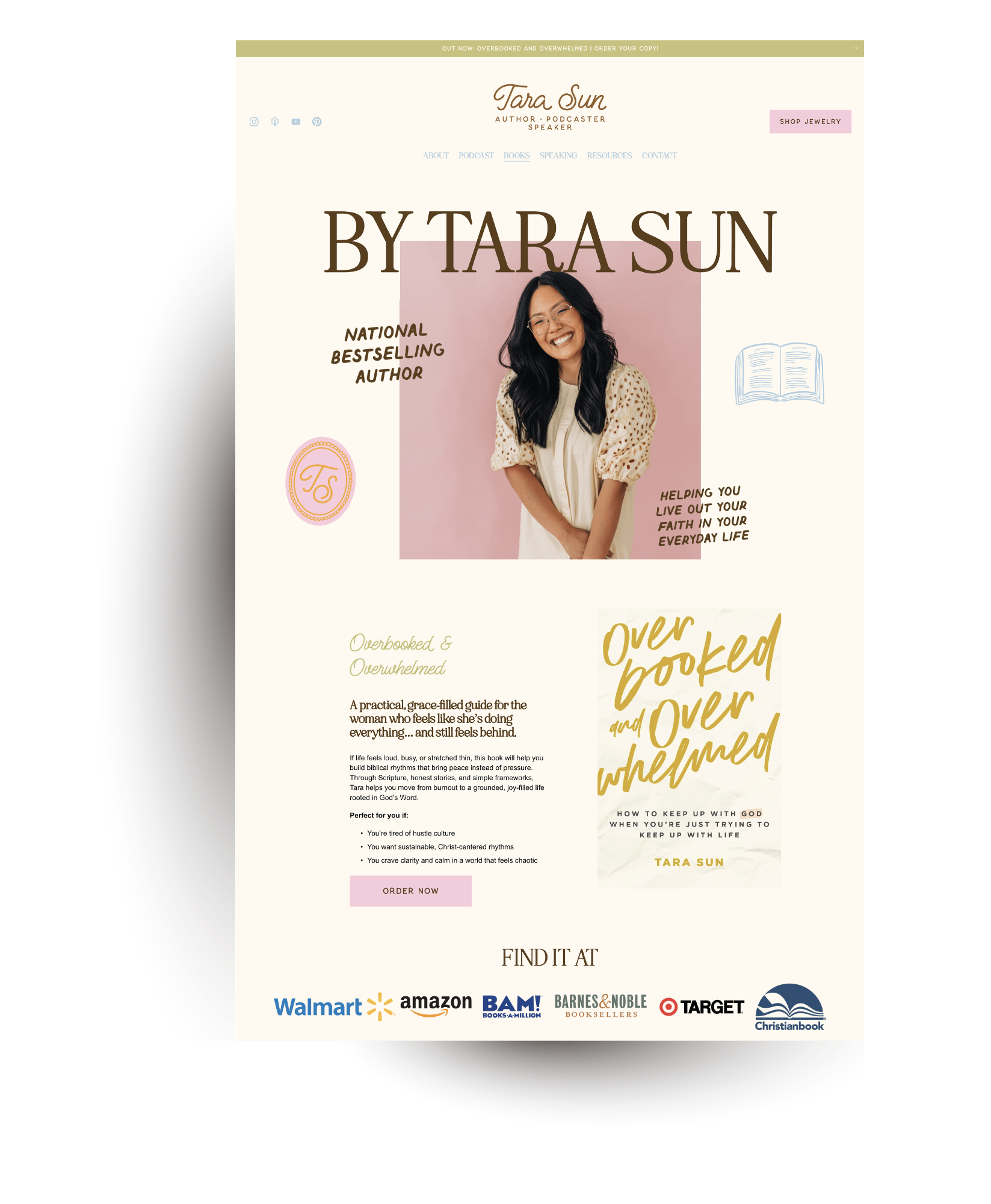
With a cohesive brand identity in place, the website became the next critical piece. Tara’s platform spans books, podcasting, speaking, social media, and physical products. The website needed to bring all of that together in one clear, streamlined experience.
The key goals for the website were to:
Create a clear home base for her ministry that feels cohesive with her updated brand
Make it easy for visitors to discover her books, podcast, and speaking information
Guide new visitors from social media into deeper engagement
Build a flexible foundation that can grow with future launches and digital products
Her previous website leaned heavily neutral and minimal. While clean, it did not fully reflect the joy, warmth, and vibrancy of her personality. The new Squarespace design integrates her full color system, typography, and illustrations to create a consistent and recognizable experience across every page.
We built:
Clear navigation that directs users to Books, Podcast, Speaking, and Shop without confusion
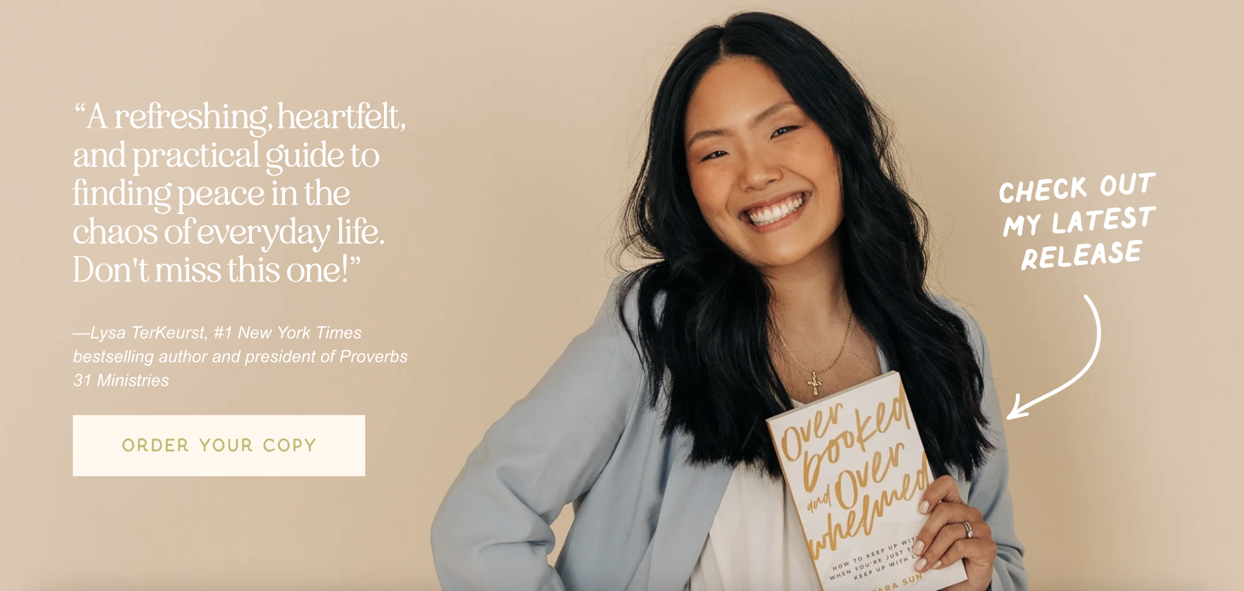
Strong call-to-action buttons to support book sales and podcast listening
Branded sections that allow her content to feel dynamic rather than static
Custom layouts that highlight her authority while still feeling personal and inviting
Mobile-responsive design so her audience, who primarily finds her through Instagram and podcast platforms, has a seamless experience on their phones
Because so much of her audience first encounters her through Instagram or podcast apps, mobile responsiveness was essential. The website was designed to feel just as intentional and engaging on a phone as it does on desktop. Now, her website feels like a true extension of her brand. Bright and joyful but structured and purposeful. Its personal yet professional design now supports her ministry instead of simply housing it.
Copywriting
For Tara, the goal was to create copy that felt warm, trustworthy, and deeply encouraging. Her voice is not loud or flashy. It is gentle and confident in truth. The website needed to reflect that.
This included:
Reworking headline messaging to clearly communicate who she serves and what she helps women do
Clarifying her brand positioning as an author, podcaster, and speaker
Refining calls to action so visitors know exactly what to do next
Structuring page flow to guide readers naturally from inspiration to engagement
Because much of her audience discovers her through Instagram and podcast platforms, the copy needed to quickly establish credibility while still feeling personal. The result is messaging that supports her mission to help women uncomplicate Scripture. It invites, encourages, and guides without overwhelming.
Now, her words and visuals work together instead of competing. Every page feels cohesive. Every section reinforces her voice. And every call to action leads with purpose.
Since completing her rebrand and website, Tara has stepped into this next season of ministry with renewed clarity and confidence. While her full public launch is still unfolding, early feedback from trusted friends and family has already highlighted the warmth, cohesion, and clarity of the new direction.
More importantly, Tara now has a brand and website that feel aligned with the depth of her message. Her visuals reflect the joy, encouragement, and biblical grounding she is known for. Her platform feels unified instead of scattered. And she has a flexible design system that will support future books, speaking engagements, product launches, and growth for years to come.
RESULTS

Client Love Note
“It’s not cheesy or dramatic to say that working with Sophie and her team for my rebrand was one of the best decisions I made. For the longest time, I hesitated in investing in myself and my brand, but it amazes me just how refreshed and renewed I feel after working with Sophie on a new brand and website.
What makes Sophie stand out is her warmth in communication and in her creativity. Her designs are not only beautiful, but they are inwardly meaningful and for me, that was the most important thing I wanted to convey to my audience through my brand. Give yourself the gift of working with Sophie — you won’t regret it!”
-Tara Sun
Branding & Website Design For Personal Brands
If you’re an author, speaker, content creator, or personal brand dreaming of a brand that feels as bold, polished, and full of personality as your work, let’s make it happen.
My brand strategy, custom branding design, and Squarespace website services are built to help you clarify your voice, elevate your online presence, and create a cohesive platform that supports long-term growth. When your visuals and messaging align, your brand stops feeling scattered and starts feeling intentional, confident, and recognizable.
You do not need to piece everything together alone. You need a strategic system that works as hard as you do.


FAQ
-
Each project begins with in-depth brand and website questionnaires, followed by creative direction through curated mood boards and strategic positioning work. From there, I build a complete brand suite including logos, typography, color palette, and supporting design assets. If you choose website design, we translate that cohesive identity into a fully custom Squarespace website designed for clarity, user experience, and growth.
-
How much does personal brand website design cost?
Investment depends on the scope of your project and whether you are pursuing a full rebrand or a smaller brand refresh.
On average, brand design projects begin around $3,000 and custom Squarespace website design typically lands around $3,500. Most clients choose to combine both for a cohesive, strategic experience from top to bottom.
Payment plans are available to make the investment sustainable, and every proposal is tailored to your specific goals and needs.
-
Brand projects typically take 4–6 weeks from onboarding to brand presentation. Brand and website projects generally take 6–10 weeks depending on scope and feedback timelines. You will always know what stage we are in and what comes next.
-
I design custom websites on Squarespace! It’s clean, powerful, and actually user-friendly, which means you won’t need to panic every time you want to update a sentence or swap a photo. We love a platform that works with you, not against you.
-
Short answer? Yes!
Your website is only as strong as the brand behind it. If your visuals and messaging feel scattered, your website will too. We build the brand foundation first so your site feels cohesive, strategic, and confident from the very first scroll.
-
That’s totally fine! We’ll review what you have and decide whether you need a full rebrand or just a strategic refresh. Sometimes it’s a glow-up. Sometimes it’s a full transformation. Either way, we make sure it actually supports where you’re headed.
-
Absolutely! I am not building you a tech maze. You’ll be able to update blog posts, swap photos, and make small edits without stress. My goal is to set you up with something beautiful and manageable.
-
Most clients book 1–3 months out. If you have a book launch, speaking event, or big announcement on the horizon, I recommend reaching out early so we can plan everything intentionally!
-
If you’ve ever thought, “This doesn’t feel like me anymore,” that’s usually your sign.
If you hesitate to send people to your website, constantly tweak Canva graphics, or struggle to clearly explain what you do, it may be time. And that’s exciting! Growth deserves visuals that match it.
Still trying to decide? Read Refresh vs. Rebrand: Small Biz Branding Made Simple and 6 Signs Your Website Doesn’t Reflect Your Brand Identity Anymore
-
You’re not getting a cookie-cutter template over here! Every project starts with strategy, thoughtful creative direction, and intentional design decisions. I care just as much about how your brand feels as how it functions. It should look beautiful, yes. But it should also work hard for you behind the scenes.
-
You can! But if you’re exhausted trying to do it all yourself, that’s your cue. Investing in strategic branding and website design frees you up to focus on what you actually do best. And that’s a gift to your future self.