
6 Signs Your Website Doesn’t Reflect Your Brand Identity Anymore
6 Signs Your Brand Identity No Longer Matches Your Business & What To Do

If you cringe when someone asks for your website link… this is for you.
If you’ve ever said things like:
“I’ve had it redone three times but I still don’t like it.”
“This was a template I bought on Etsy.”
“It’s just not engaging.”
Or you find yourself adding a disclaimer like, “My website needs to be updated…” every time you send the link…
That’s not just a design problem, it’s actually a brand identity problem.
The truth is, most small businesses outgrow their first website faster than they expect. What worked when you were just getting started (a DIY template, a quick logo, something “good enough”) often can’t support where your business is now. And when your website branding no longer reflects your growth, your confidence in marketing it starts to shrink too.
Your website is one of the most visible expressions of your brand identity design. It’s not separate from your brand, it’s a direct extension of it. The colors, typography, imagery, messaging, layout, and user experience all communicate something before a potential client ever even fills out your contact form.
When your branding and website design aren’t aligned, it creates some serious friction! It confuses your audience, weakens trust, and it can quietly cost you clients and customers.
In this post, I’m walking you through six clear signs your website no longer reflects your brand identity, and what to do if you recognize yourself in them. If you’ve been feeling called out or quietly ready for an upgrade, this will help you pinpoint EXACTLY where the disconnect is and how to move forward strategically.
Why Brand Identity Matters (And What It Actually Is)
Let’s simplify this first. Brand identity design is your visual storytelling.
It’s how your business communicates who you are in a matter of literal seconds, before someone reads a full paragraph, before they scroll your services, before they decide whether to stay or (BUM BUM BUM) click away.
Your brand identity is how your business looks, feels, and presents itself. It’s your signature, your style, the visual system that gives life to your services and makes you recognizable in a sometimes highly overcrowded market.
For small business owners especially, this matters more than you might realize.
Big brands can rely on household recognition. Sis, can I be honest with ya? You and I just don’t have that kind of luxury. We don’t have million-dollar ad budgets or decades of brand familiarity to fall back on. That means your brand identity has to do more of the heavy lifting. It has to catch attention quickly. It has to communicate credibility instantly. And it HAS to make someone feel something before they ever speak to you.
That’s where visual storytelling becomes so important.
Your colors, typography, imagery, logo suite, and overall website branding all tell a story about:
Who you serve
What you value
The caliber of work you provide
The experience clients can expect
When that story is unclear or inconsistent, people hesitate. When it’s cohesive and intentional, they lean in.
This is especially true in branding for small business, where first impressions often determine whether someone inquires or moves on.
A powerful example of this is my work with Camino & Company. Before their rebrand and website redesign, they were primarily operating as a mobile florist doing pop-ups. They had talent, vision, and potential, but their branding and website design weren’t fully telling that story. This was holding them back from scaling in many ways.
When we rebranded and redesigned their website, it was like everything changed in a flash. Even I was shocked!
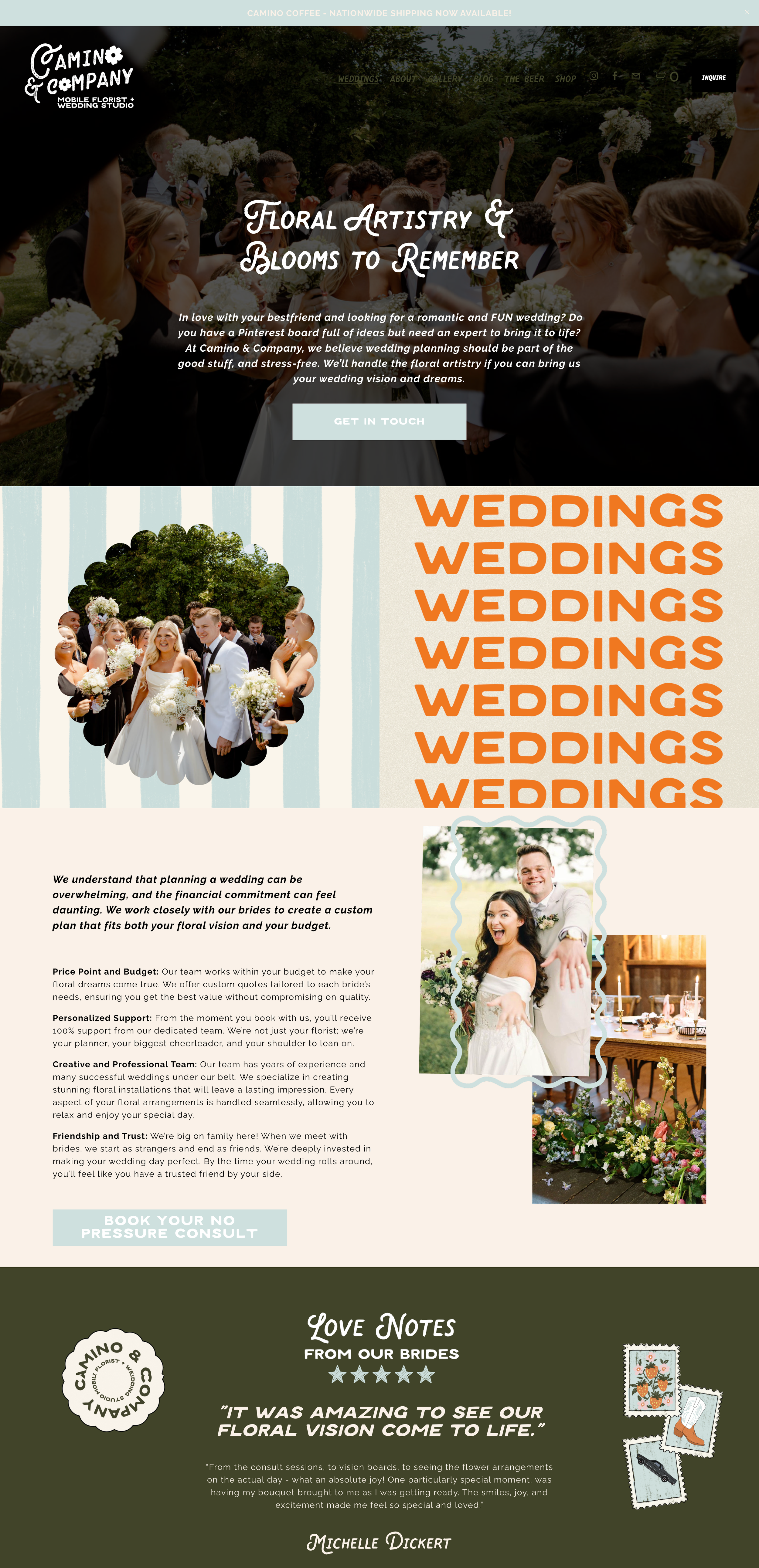
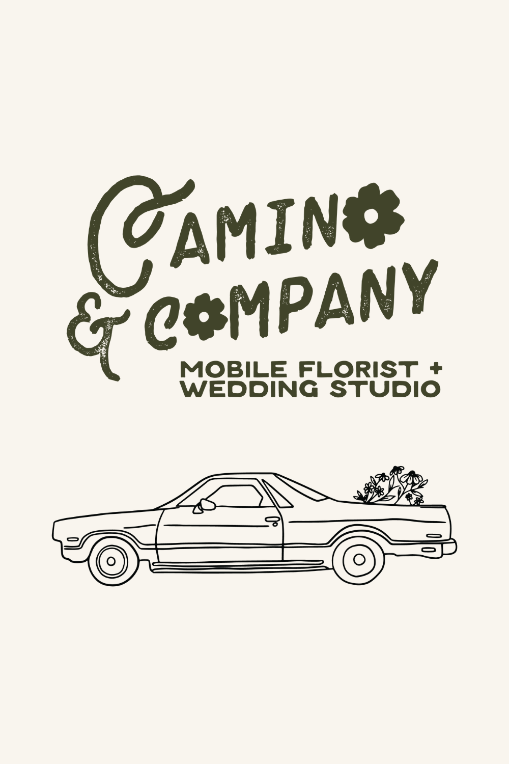
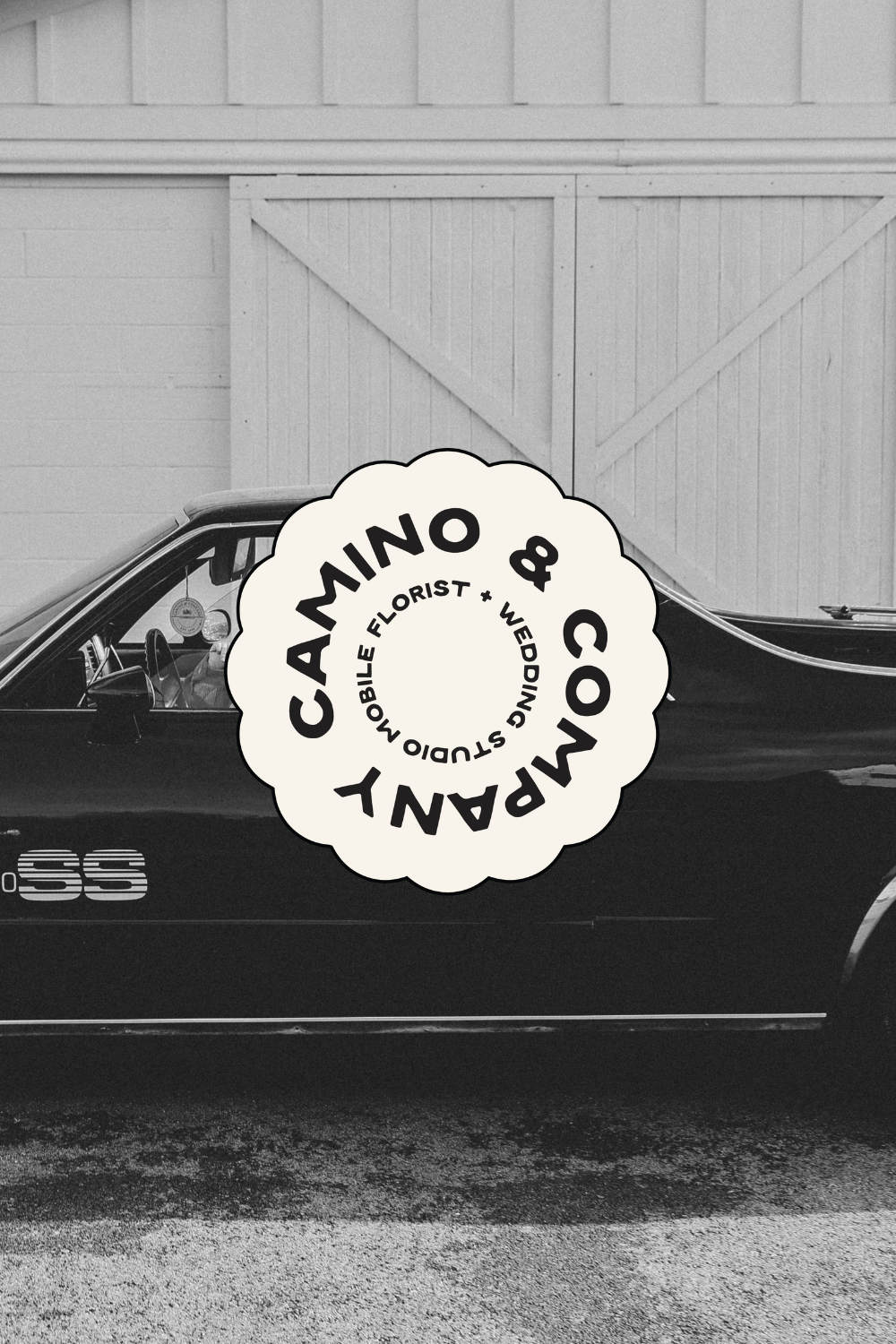
Their new brand identity clarified who they were becoming, not just who they had been. It visually supported their transition into the wedding industry, and that shift was strategic. During their relaunch, they gained thousands of followers and tripled their leads in a single month. Today, weddings make up the majority of their business, Karly (the founder of Camino & Company), was able to bring her mom on as a full time head of operations, and they even hired a full time floral designer to have on staff. The growth has been exponential!
And let me just say, the difference wasn’t just a prettier logo. It was a cohesive brand identity paired with a website that told the right story, to the right audience, at the right time.
That’s the power of alignment between your brand identity and your website.
Your website isn’t separate from your brand, it’s actually the most visible and valuable expression of it. And when those two things fall out of sync, your growth can stall without you even realizing why.
So, let’s talk about the signs that might be happening…
1. Your Website Looks Nothing Like Your Social Media
One of the clearest signs your website doesn’t reflect your brand identity anymore?
Your Instagram feels elevated… but your website feels DIY.
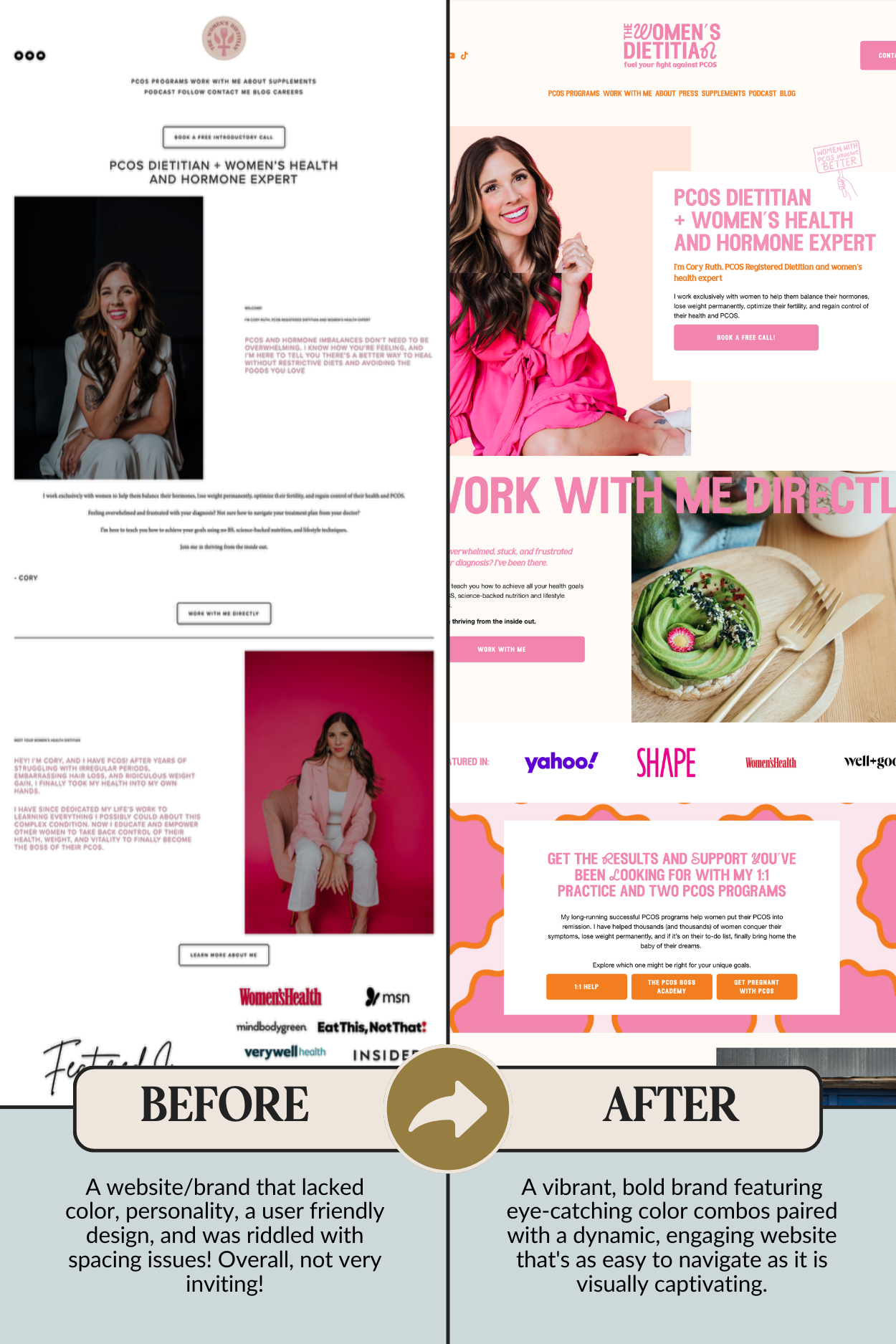
I’ve seen this happen more than once. A perfect example is my client Cory Ruth. She had a thriving Instagram with over 400,000 followers — vibrant, colorful, high-production recipe videos, features in major publications, and a strong presence in the PCOS and women's health space. Her content felt polished and credible.
But when you clicked over to her website?
It was black and white, ultra minimal, spacing was off, and text was hard to read or cut off in places. It didn’t reflect the warmth, expertise, or authority she had built on social media. There was a disconnect between her website branding and the brand identity her audience already knew and loved. And when that happens, trust takes a hit. People click away.
What Is Visual Consistency (Really)?
Visual consistency is when every touchpoint of your business looks and feels like it belongs to the same brand.
It means:
Your website uses the same color palette as your Instagram
Your typography feels cohesive across platforms
Your logo variations are applied intentionally
Your imagery, spacing, and layouts feel aligned
A stranger could instantly tell your Instagram and website are from the same business
It’s not about perfection…it’s about COHESION!
When your brand identity design is consistent across platforms, it reinforces recognition and builds familiarity, which ultimately leads to trust.
When it’s inconsistent? It creates friction.
And yes… this is where I’m going to gently call out the mismatched Canva fonts
If your Instagram graphics use one script font, your website uses three different serif fonts, and your sales page suddenly introduces something completely new “just because it looked cute”… that’s not brand personality. That’s visual confusion.
Here are three quick things I immediately look for when auditing branding and website design:
Mismatched colors that don’t follow a defined palette
Inconsistent font pairings across pages
An outdated or old logo still floating around somewhere
These might seem small, but together they signal a lack of clarity.
When we redesigned Cory’s brand and website, everything came back into alignment. Her new site became colorful, strategic, and cohesive with the presence she had already built online. It finally felt like the digital home her business deserved, and she felt proud to send people there..
That confidence matters. Because when you feel confident about your website, you market it differently.
2. Your Copy Doesn’t Sound Like You
Another major sign your website no longer reflects your brand identity design is this:
Your copy feels… off.
It might technically say what you do, but it doesn’t sound like you. It doesn’t feel engaging. And it definitely doesn’t feel memorable.
Some of the most common copy mistakes I see in branding for small business websites are surprisingly simple:
Saying “we” when it’s just you.
Using overly trendy words like “boost” or “elevate” without saying anything specific.
Writing paragraphs full of fluffy language that sounds impressive but means nothing.
Sounding overly corporate or robotic when you are actually warm and personable in real life.
Another big one? Zero personality.
If someone read your website without seeing your logo, would they know it’s you? Or could it belong to anyone in your industry?
Your brand identity design is not just colors and fonts. It is voice. It is tone. It is the way you phrase things. It is what you choose to emphasize. It is the little touches that make someone think, “Oh. I like her.”
And please. Use formatting!
Headlines matter. Subheadings matter. Bullet points matter. People skim. They always will! If your website is one giant block of text with no visual hierarchy, your messaging gets lost no matter how good it is.
I also gently tell clients this: if you’re copying and pasting AI-generated copy without editing it to sound like you, people can tell. Your audience is smarter than you might be giving them credit for girl!! They know when something feels generic. Tools can abbbbsolutely support your process, but they cannot replace your voice.
One simple tip I give clients all the time is this:
Read your website out loud.
Does it sound like how you actually talk to clients?
Would you say those exact words on a sales call?
Does it feel natural?
While I am not primarily a copywriting studio, we do provide strategic website copy as part of our branding and website design process. That support alone eases a huge burden for small business owners. It gives clients structure, clarity, and most importantly, it gives them something intentional to build from instead of staring at a blank page.
When your website copy aligns with your visual identity and your actual personality, your website branding feels cohesive!
3. You’re Embarrassed To Send People To Your Site
This one is emotional, but it is very real.
If you hesitate before sending someone your website link, THIS IS A GIANT SIGN.
If you find yourself saying, “It needs to be updated” or “Ignore that page” or “I haven’t redone it yet” every time you share it, your website is NOT supporting your brand identity design. In fact, it’s working against it.
Confidence plays a huge role in marketing. When you feel proud of your website, you send the link more often. You talk about it more. You use it as a tool. When you feel embarrassed by it, you subconsciously avoid it.
I saw this shift clearly with Cory Ruth. Before her brand and website redesign, she had a massive Instagram following and a strong reputation in the PCOS space. But her website did not reflect that level of expertise. It felt minimal in a way that came across as unfinished. The spacing was off. The layout did not feel intentional. It did not match the warmth, authority, and personality she showed everywhere else.
After we aligned her branding and website design, everything changed.
Her new site felt colorful, strategic, and fully representative of her brand. It became a place she felt confident sending her audience. A place that reinforced her authority instead of quietly undermining it.
That confidence matters more than people realize.
Your website should feel like an extension of your growth. It should reflect the caliber of your work. It should support your marketing efforts, not make you caveat them.
If your site makes you shrink instead of stand tall, it is time to pay attention.
4. You’re Attracting The Wrong Clients Or None At All
If the wrong people keep landing in your inbox, your website might be sending mixed signals.
Your brand identity design does more than make you look polished. It communicates who you are for and who you are not for. When that messaging is unclear or outdated, you end up attracting clients from a previous version of your business.
A perfect example of this is LCJ Photo + Film. Lucy Jones had built a strong reputation in the wedding space. But her business had evolved. She was making a major shift into small business photography and videography, specifically in the construction industry. As you can imagine, that is NOT a small pivot. That is a completely different audience with different expectations and different needs!
The problem was that her website still reflected her wedding era. So what happened? You guessed it, she was still attracting wedding inquiries.
Not because she was incapable of booking commercial work. Not because she lacked skill. But because her branding and website design were simply just telling the wrong story.
When we redesigned her website to reflect where her business was now, everything changed, including how she showed up to market herself and her business. The visuals, messaging, and layout spoke directly to the type of clients she wanted to work with. She finally had a place she could confidently send those dream leads and think, “Yes. This represents me.”

If you are attracting:
Budget clients when you want premium ones
Inquiries outside your niche
Leads that ghost you after reading your services
Or no inquiries at all…
It is worth asking whether your website branding is clearly communicating who you serve and what makes you different.
Your website should filter for you. It should be pre-qualifying your leads. It should make the right clients feel seen and the wrong ones quietly move on.
When your brand identity and your website are aligned, your site becomes a magnet instead of a guessing game.
5. Your Site Feels Hard To Update Or Too Outdated For Small Tweaks
Sometimes the issue is not just how your website looks, it’s how it functions. If your site feels clunky, frustrating, or impossible to update without breaking something, this is a problem. And it is more common than you think.
Two of the biggest frustrations I hear from clients are:
“This template just feels clunky.”
“It is so hard to edit anything.”
When your website is difficult to update, you stop updating it. New offers do not get added. Headshots stay outdated. Copy stays untouched. And slowly, your website branding drifts further and further away from your actual business.
Your website should not feel like a puzzle you are afraid to touch. It should feel like a tool you can confidently use. This is one of the reasons I strongly recommend Squarespace for my clients.
Some platforms look beautiful but aren’t very user-friendly for someone who is not tech-savvy or design-trained. Others are overly complex, outdated, or require constant maintenance. When you are running a small business, you do not need another system that drains your energy.
Squarespace strikes the balance. It’s clean, modern, and intuitive. It allows your branding and website design to shine without requiring you to be a developer. It makes it easy to:
Update photos
Adjust copy
Add new services
Keep your content current
And when your site is easy to manage, you stay consistent. You keep it aligned with your brand identity design. You do not let it sit untouched for three years!!!
I have seen websites go from frustrating and neglected to fun and empowering simply because they were rebuilt on a platform that actually supports the business owner.
Your website should work as hard as you do. It should evolve with your goals. It should not feel like something you are constantly fighting.
6. Your Website No Longer Matches Your Business Goals
Sometimes your website looks fine.
It’s not broken, not ugly but not beautiful, and yeah, technically, it works.
But it does not reflect where your business is headed.
This is one of the most common disconnects I see in branding and website design. A business evolves, the vision gets clearer, services expand, pricing begins to increase, but the website stays stuck in the beginner phase. And that gap is what quietly holds you back as a small business owner.
Maybe you have added a new service, but there is no dedicated page for it.
Maybe you launched a product, but there is no intentional space for people to shop it.
Maybe you niched down, but your messaging still speaks to everyone.
Maybe you are expanding, but your website still feels small.
When your goals evolve but your website does not, your brand identity design starts to feel disconnected from reality.
Your website should support your growth. It should showcase your newest offers. It should speak to the clients you want now, not the ones you had three years ago.
These are questions I often ask clients during discovery:
Does your website clearly showcase your current services?
Is it speaking directly to your ideal client today?
Does it reflect your pricing and positioning?
Does it support the direction you are moving toward?
If the answer to those questions is no, that does not mean you failed. It simply means your business has grown faster than your website.
And that is actually a good problem to have!
Updating your site when you have outgrown it is not an unnecessary expense. It is a strategic investment. When your website aligns with your goals, it becomes a lead-generating tool instead of a placeholder. It works behind the scenes while you relax, builds credibility, filters inquiries, and supports expansion.
Your website should not feel like it belongs to a previous version of you. It should feel like it belongs to the business you are building right now!
Ready To Feel Proud Of Your Website Again?
If you recognize yourself in more than one of these signs, you are not alone my friend! Most small business owners outgrow their first website faster than they expect. I know this from personal experience!
The good news is that alignment IS possible.
When your brand identity design and your website branding work together, everything feels easier. Marketing feels clearer. Messaging feels stronger. Growth feels supported instead of stalled.
If you are ready to make your website feel like you again, I would love to help.
Let’s build a brand and website that reflects the caliber of business you are running and the direction you are headed.
Book a discovery call and let’s talk about what your next chapter should look like.
Ready to Take the Next Step?
Whether you’re feeling pulled toward a strategic brand refresh or know deep down that it’s time for a full rebrand, you deserve branding that reflects the caliber of business you’re building.
If you’re ready to stop guessing and start moving forward with clarity, I’d love to help.
Book a discovery call here and let’s talk through your goals, your brand, and the best next step for your business.
Work With Us!
If you're not sending weekly newsletters to your email list, you're missing out! We'll refresh your email strategy with Flodesk (our favorite email marketing platform on the market) and we'll handle all the setup and implementation of this new platform for a hands-free, easy experience.
We'll give you training on how to use the platform and get your email marketing ready to rock and roll with a strategically crafted 3-part welcome sequence PLUS ideas/prompts for your next 4 weekly newsletters to get the ball rolling.
PS - Interested in monthly email retainers? Just send us an email and we can chat!
Includes:
General Opt-In Form Strategy + Set Up (so you can collect email subscribers)
Flodesk Email Setup + Scheduling for a Hands-Free Experience
3 Templated Designs (you can use again and again)
3-Part Welcome Sequence (design, strategy, and copy)
4 Weekly Newsletter Prompts


Simply Sophie Designs helps female-led small businesses go from a stressful “do-it-all” marketing approach to having a memorable brand, strategic website, and results-driven launch support that boosts their growth beyond what they once thought was possible.