
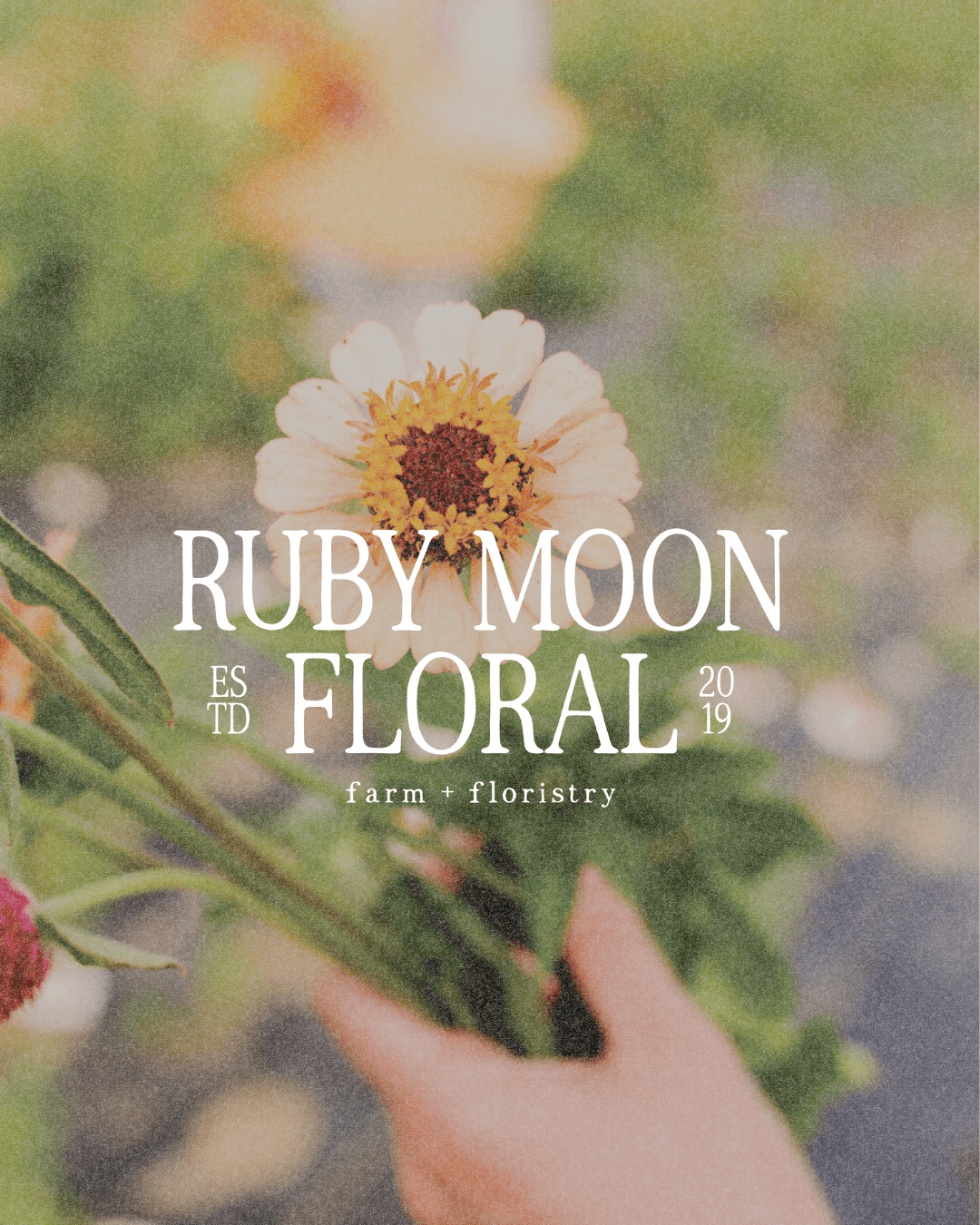
A Brand Designer's Romantic Redesign for a Flower Farm & Floral Design Studio
SERVICES: BRAND DESIGN, WEB DESIGN, COPYWRITING, TAGLINE DEVELOPMENT
BRAND TRAITS: Romantic, Elegant, Old World, Handcrafted, Elevated, Detail-Oriented
INDUSTRY: FLORAL + AGRITOURISM
Florist Branding, Website Design & Copywriting For Ruby Moon
Ruby Moon Floral isn't your run-of-the-mill flower shop. Kari Geary got her start on her grandmother's farm, gathering eggs, picking lilacs and peonies, and falling in love with flowers years before she ever called herself a florist.
She went on to build a career as a floral designer and even owned a retail flower shop, but she realized arranging flowers wasn't her only passion. She wanted to grow them herself, too.
Today, Ruby Moon is a working flower farm and a refined floral design studio in Fort Wayne, Indiana. When it came time to bring those two worlds together under one brand, Kari knew she needed a brand designer who could tell the whole story, not just the wedding half of it.
Together, we created a romantic, old-world brand identity and website that finally lets Ruby Moon be everything it was always meant to be.
Not Your Typical Wedding Florist
Most florists in Kari's market operate purely as design studios. Ruby Moon is both a working farm and a floral design business, and that duality needed to sit at the center of the brand as her biggest differentiator.
Kari grows many of the flowers she designs with. She also offers full wedding florals, DIY buckets, U-picks, seasonal workshops, flower subscriptions, and a farm stand that runs through the growing season.
That's a lot more than the word "florist" can carry, so we built the brand around a tagline that could: Farm + Floristry.
If you're reading this and realizing your floral business doesn't feel as clear, polished, or professional as you want it to, that's okay. That's exactly the gap I closed for Kari.
The Brand Identity Vision For This Farm-Grown Floral Studio
Kari wanted Ruby Moon to feel elegant and timeless without losing the hands-in-the-dirt reality of running a working farm. Her previous branding didn't have room to hold both sides of that story, so I built a cohesive identity and custom Squarespace website that feels like the real flower farm behind it.
I drew inspiration from European gardens and countryside estates, which shows up in:
Antique details
Traditional print materials
Vintage packaging
Estate signage
Garden gates
Climbing roses
Structured elements like serif type, seals, and stamps sit next to softer touches in hand-drawn florals, textures, and illustrations.
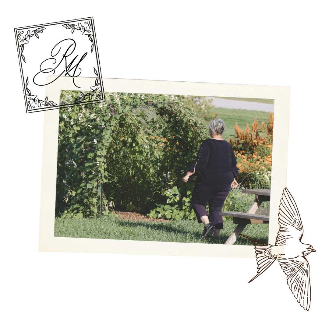
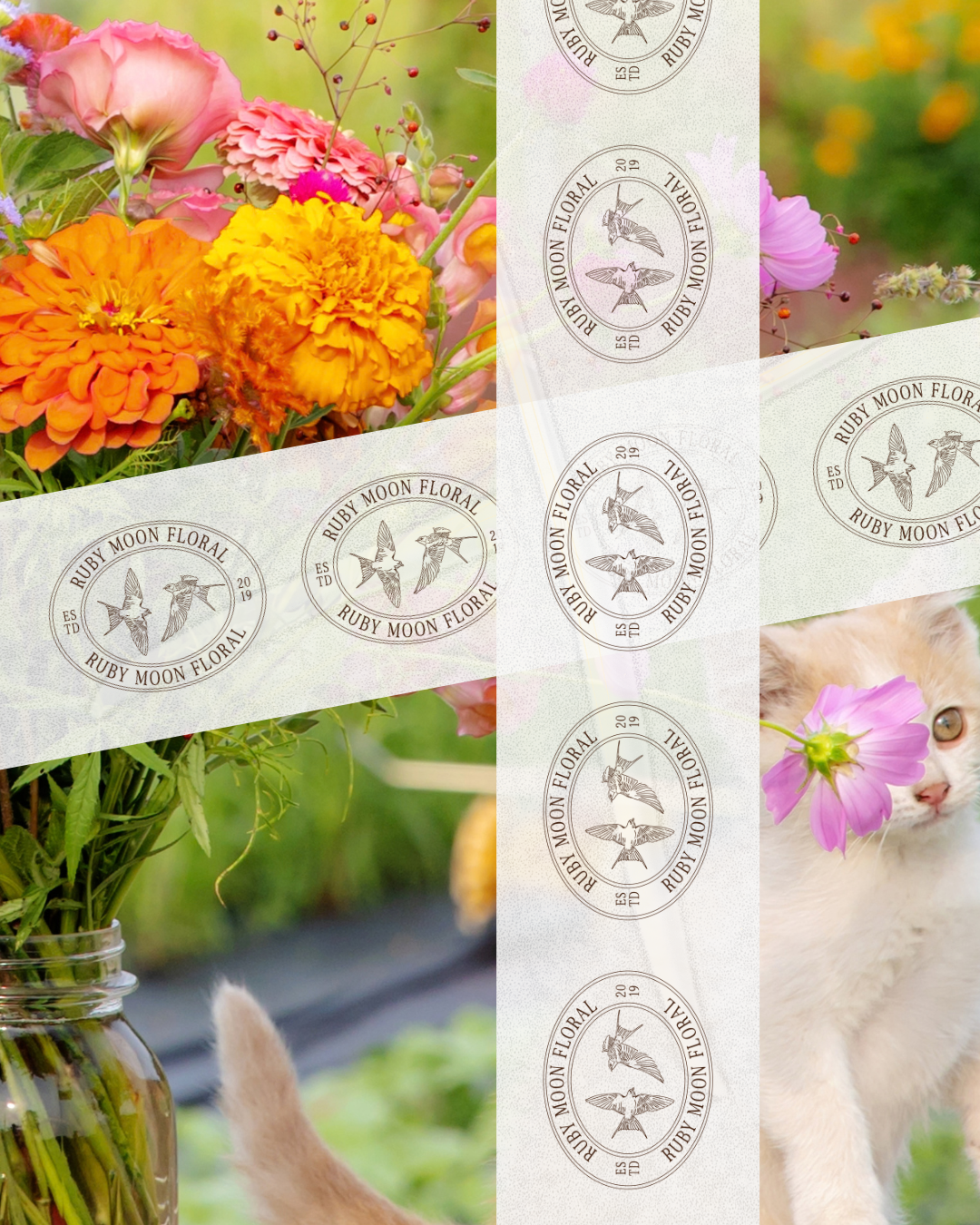
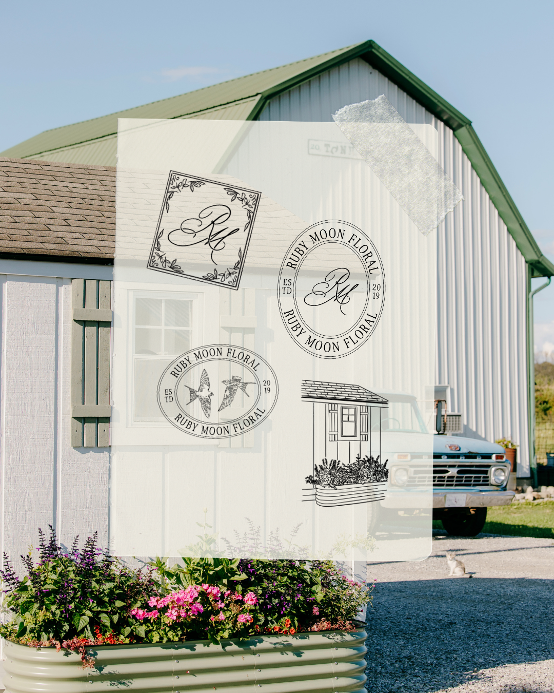
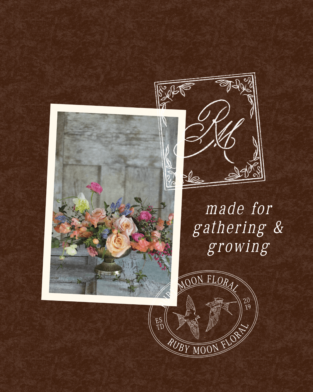
The arched garden gate became the centerpiece of the primary logo. It symbolizes gathering, making it the perfect anchor for a brand about growing something and inviting people in. Supporting brand elements include barn swallows, heritage-inspired seals and maker's marks, and a custom RM monogram.
Farmer-Florist Branding to Show Ruby Moon As More Than A Wedding Florist
With the identity in place for the brand refresh, I focused on storytelling, seasonality, and a visual system Kari could carry across her entire brand, both online and offline.
The Process
Every project starts with understanding the client's story, her ideal client, and where her current brand was falling short. From there, I built a brand suite, website, and messaging that work together, instead of feeling like three separate projects stitched into one. That’s the value of working with a single provider on a brand refresh.
Key Design Ideas
Colors: Earthy greens, warm browns, and muted neutrals pulled from the farm itself, layered with dusty floral tones, creams, soft blues, and plums pulled from the flowers Kari grows and arranges. The palette feels romantic and elevated, but still connected to the land.
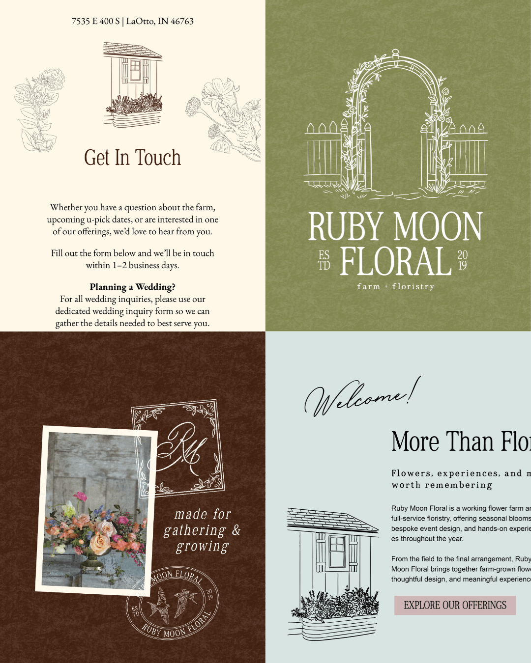
Icons: An arched garden gate as the primary mark, plus a custom RM monogram, barn swallows, and heritage-style seals, brought to life with hand-drawn illustrations throughout the brand.
Fonts: Traditional serif typography paired with softer, handwritten touches, giving the brand a structured, old-world feel that still leaves room for warmth.
Brand Design
Every color, typeface, and mark in this system was chosen to show the elegance of a refined floral studio and the character of a working farm. That's a tough balance, which is why a strong brand strategy had to come before the logo.
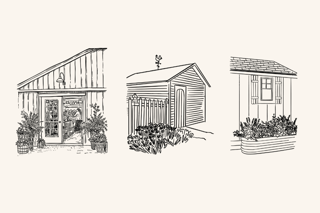
Hand-Drawn Branding Illustrations
Rather than leaning on generic floral clip art, I illustrated the actual spaces and objects around the Ruby Moon farm:
The garden gate
Watering cans
Boots
Vintage frames
The farm buildings
Those illustrations now live across everything, giving her a visual world that's hers alone and customers recognize when they visit the farm.
New Squarespace Website & Design
Kari needed a website that shows what she does, not just a pretty gallery. I built the site to showcase the full range of what Ruby Moon offers, with a portfolio for the floral design work and a clear, easy way for visitors to inquire or shop.
I also love bringing a site to life with movement. On Ruby Moon's site, I used scrolling background effects and turned a few of her branded icons into moving GIFs. These small touches add depth and keep the site feeling fresh instead of static.
Behind the scenes, I use custom coding to pull off some of those one-of-a-kind moments, but I keep the code light on purpose. That way, Kari can make updates herself whenever she needs to.
Copywriting
The messaging throughout the site leans romantic and warm without losing clarity. We refined Kari's service descriptions and calls to action so the "Farm + Floristry" story comes through everywhere a visitor lands. It connects what she does to the meaning and purpose behind it.
Branding and Website Design For Florists Like Ruby Moon
If you're a florist dreaming of a brand that feels as romantic and rooted as your work, let's make it happen. My florist branding and custom Squarespace website design services help you connect with your ideal clients, show the full range of what you offer, and grow with confidence.